Every person who lands on your website arrives with a specific goal in mind. They might be looking for your pricing, reading a blog post, or trying to contact your team. The journey to that goal can either be a seamless, satisfying experience or a frustrating dead end. The difference almost always comes down to the quality of your site’s navigation. A logical and intuitive structure empowers users, making them feel confident and in control. This positive feeling is directly tied to their perception of your brand. It’s essential to ask, what are the benefits of site navigation improvement for enhanced user experience? and how does that translate to business success?
Key Takeaways
- Navigation is the foundation of user experience: A clear, intuitive menu system is the most critical element for keeping visitors on your site. It reduces frustration, builds confidence, and makes your brand appear more professional and trustworthy.
- A clear site structure directly drives business goals: By creating a straightforward path for users, you remove barriers to conversion, making it easier for them to make a purchase or book a demo. This structure also supports your long-term SEO performance by helping search engines understand your site.
- Optimization is a continuous, data-driven process: Don't set your site's menu and forget it. Regularly use analytics and user feedback to understand how people move through your site, identify friction points, and test improvements to create a better user journey.
What is Site Navigation and Why Does It Matter?
Think of your website's navigation as its roadmap. It’s the system of menus, links, and other elements that guide visitors to different pages and sections. When this system is poorly designed, visitors can’t find what they need and are more likely to leave. Good navigation, on the other hand, makes a site feel intuitive and easy to use, creating a positive first impression.
Effective navigation is a cornerstone of a strong user experience (UX). It helps people find information quickly, understand where they are on your site, and discover new content. When you get it right, users feel confident and in control, which encourages them to stay longer and explore what you have to offer.
Define site navigation and its core components
Site navigation is the collection of user interface elements that allow visitors to move between pages on your website. It’s more than just the main menu in your header. Core components include the primary navigation bar, footers, sidebar menus, breadcrumb trails, and internal links within your content. Each element serves a purpose, working together to create a cohesive pathway through your site. A well-structured navigation system acts as a clear guide, ensuring users can find information like your pricing, services, or contact page without confusion or frustration. This structure is fundamental to keeping visitors engaged and helping them achieve their goals on your site.
How navigation shapes the user experience
Clear and consistent navigation is the foundation of a positive user experience. When visitors arrive on your site, they expect to find what they’re looking for with minimal effort. An intuitive layout with logical menus and helpful features like search bars and breadcrumbs makes this possible. This predictability reduces cognitive load, meaning users don’t have to think hard about how to get around. Instead, they can focus on your content and offerings. A seamless navigation experience builds trust and makes your website feel professional and reliable, encouraging visitors to spend more time on your pages.
How navigation affects user behavior
Your site’s navigation directly influences key user behaviors that impact your bottom line. If visitors can’t easily find what they want, they are more likely to leave, increasing your bounce rate. According to a study by Clutch, 94% of people say easy navigation is the most important website feature. When navigation is confusing, it creates a barrier to conversion, preventing users from making a purchase, signing up for a newsletter, or booking a demo. Search engines also pay attention to these user signals, meaning poor navigation can harm your SEO performance over time by indicating a low-quality user experience.
The Costs of Poor Navigation
When your website's navigation is confusing or broken, it’s more than just a minor annoyance for visitors. It creates tangible problems that can hinder your business growth, from losing potential customers to damaging your brand's reputation. A poorly designed navigation structure acts like a roadblock, preventing users from finding what they need and stopping your business from achieving its goals. Let's look at the specific consequences of getting it wrong.
User frustration and higher bounce rates
Think about the last time you landed on a website and couldn't find what you were looking for. You probably felt frustrated and clicked away within seconds. This quick exit is known as a bounce, and it’s a clear sign that your site isn't meeting user needs. When navigation is unclear, visitors feel lost and annoyed, leading them to abandon your site for a competitor's. A study by Clutch found that 94% of people consider easy navigation the most important website feature. A high bounce rate tells search engines that your site provides a poor experience, which can negatively impact your rankings over time.
Missed opportunities for conversion
A user who sticks around despite confusing navigation is still unlikely to become a customer. Website navigation does more than just help users find information; it guides them toward taking valuable actions, like making a purchase or signing up for a demo. These actions are your conversions. If your menu labels are vague, your call-to-action buttons are hidden, or the path to checkout is complicated, you are creating friction that stops users from converting. Every visitor who leaves without taking action is a missed opportunity. A clear, intuitive navigation system is essential to help users complete desired actions and turn their interest into measurable results for your business.
Damage to brand perception and SEO
Your website is often the first interaction a potential customer has with your brand. A disorganized and difficult-to-use site can make your business appear unprofessional and untrustworthy. This negative first impression can be hard to overcome. Beyond brand image, poor navigation directly harms your search engine optimization (SEO) efforts. Search engines like Google analyze your site’s structure to understand how your pages are related and what your content is about. A confusing layout makes it difficult for crawlers to index your site effectively, which can hurt your search engine rankings. Ultimately, a site that is difficult for both humans and search engines to understand will struggle to attract and retain an audience.
The Benefits of Great Site Navigation
Investing in your site's navigation is more than just a design choice; it's a strategic decision that directly impacts your bottom line. When users can move through your site effortlessly, they stay longer, explore more, and are more likely to convert. A clear and intuitive navigation structure acts as a roadmap, guiding visitors to the information they need and building a positive relationship with your brand from their very first click. This foundation of a good user experience is critical for turning casual visitors into loyal customers.
Improve user engagement and retention
Think of your website as a physical store. If the aisles are clearly marked and products are easy to find, customers will stick around. If it’s disorganized, they’ll leave. The same principle applies online. Good navigation directly improves user experience by making your website simple and predictable to use. Features like logical submenus, descriptive labels, and breadcrumb trails help users understand where they are and how to get where they want to go. This clarity reduces frustration, which in turn lowers your bounce rate and encourages visitors to spend more time engaging with your content, products, and services.
Encourage content discovery and return visits
Effective navigation does more than just help users complete a specific task. It also reveals the breadth and depth of what your site has to offer, showing how different pages and topics relate to each other. When your menu clearly organizes your blog, services, and case studies, a visitor who came for one piece of information might discover another valuable resource. This process of discovery makes your site feel more valuable and comprehensive. A positive and productive visit makes users more likely to remember your brand and return in the future, knowing they can easily find what they need.
Build user satisfaction and trust
Your website’s usability is a direct reflection of your brand’s professionalism. A confusing or broken navigation system can make your business seem unreliable. Conversely, a seamless experience builds confidence and trust. In fact, research shows that 94% of people believe easy navigation is the most important feature of a website. When you make it easy for users to achieve their goals, you show that you respect their time. This satisfaction is fundamental to building a strong brand reputation and encouraging visitors to take the next step, whether that’s making a purchase or booking a demo.
How to Improve Your Site's Navigation
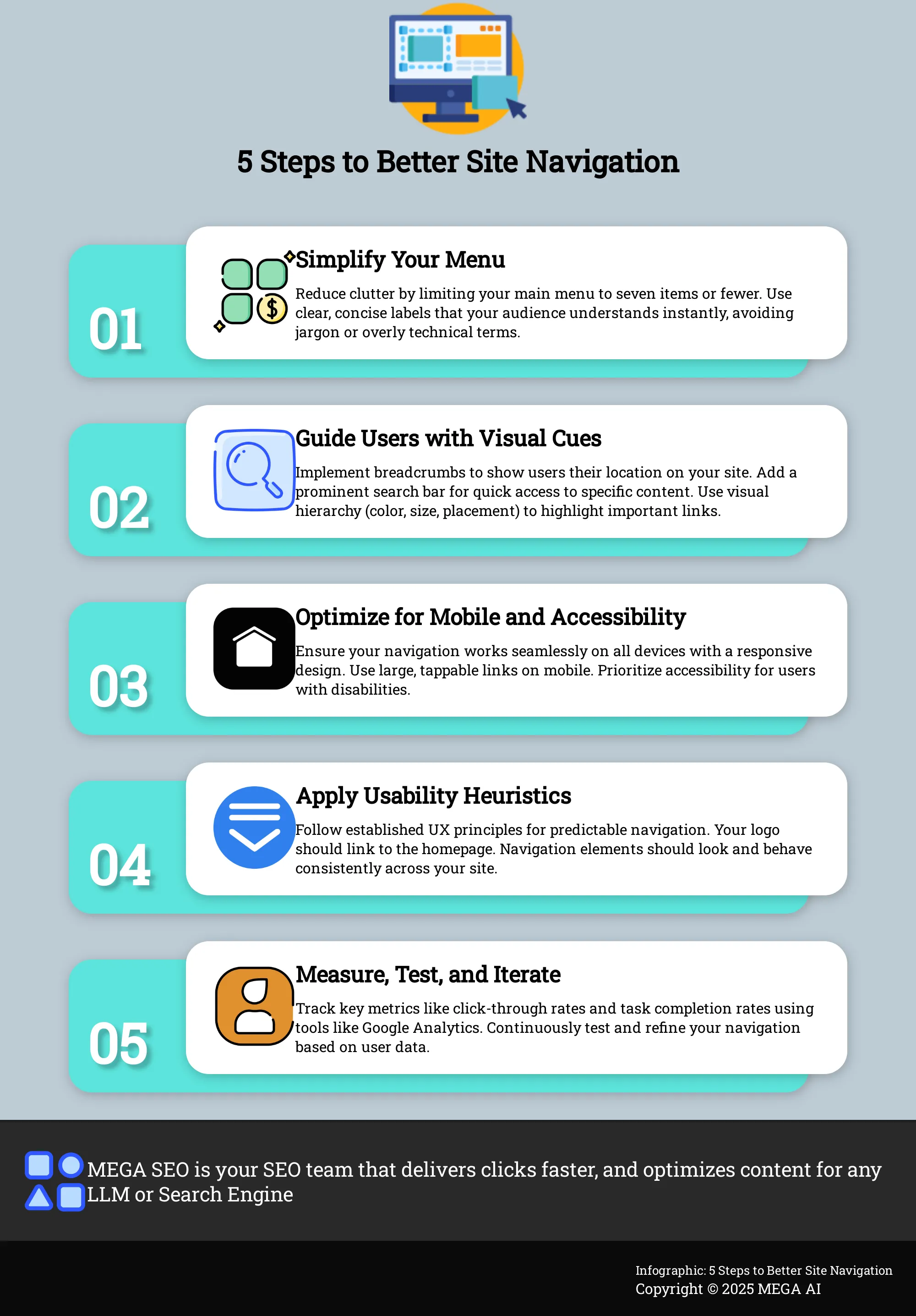
Improving your site’s navigation doesn’t have to be a massive overhaul. By focusing on a few key areas, you can create a much better experience for your visitors, which helps them stay longer, find what they need, and ultimately convert. These strategic tweaks can have a significant impact on user satisfaction and your site’s performance.
Simplify menu structures and use clear labels
When it comes to your main menu, less is more. A cluttered menu can overwhelm visitors, making it hard for them to find what they’re looking for. Aim to keep your main navigation to seven items or fewer. Organize these items logically, grouping related pages under a single, clear heading. Use straightforward language that your audience will immediately understand—avoid internal jargon or overly creative terms. Clear labels build trust and help users quickly grasp your site's purpose and offerings. A well-organized menu is the foundation of a strong information architecture and a positive user journey.
Use breadcrumbs, search, and visual hierarchy
Think of your website as a physical space. Breadcrumbs are the digital signs that show users exactly where they are and provide an easy path back to previous pages. They are especially helpful for websites with many layers of content. For larger sites, a prominent and effective search bar is essential. Many users will go straight to the search function if they know what they want. Finally, use visual hierarchy to guide your users. Design elements like color, size, and placement can draw attention to the most important navigation links and calls to action, creating a more intuitive path through your site.
Optimize for mobile devices and accessibility
A majority of web traffic now comes from mobile devices, so your navigation must work flawlessly on a smaller screen. Use a responsive design that adapts to different screen sizes. The "hamburger" menu is a standard and effective pattern for mobile navigation. Ensure all buttons and links are large enough to be easily tapped with a finger to avoid user frustration. You should also consider accessibility. Your site should be navigable for everyone, including people who use screen readers or other assistive technologies. Prioritizing mobile-friendly design and accessibility isn't just good practice; it expands your audience and improves the experience for all users.
Apply usability heuristics
Usability heuristics are essentially time-tested principles for user-friendly design. You don't need to be a UX designer to apply them. The core idea is to make your navigation predictable and consistent. For example, your company logo should almost always link back to the homepage, and navigation elements should look and behave the same across your entire site. When navigation is intuitive, users can focus on your content and offerings without getting frustrated. As research shows, poor navigation is a primary reason users abandon a website. Following established usability principles helps you meet user expectations and achieve your business goals.
How to Measure Navigation Performance
You can’t improve what you don’t measure. While you might have a good sense of how your site navigation performs, relying on intuition alone can lead you down the wrong path. To make smart, effective changes, you need to ground your decisions in data. Measuring your navigation’s performance helps you move beyond guesswork and understand exactly how users interact with your site, where they struggle, and what you can do to make their experience better. By tracking the right metrics with the right tools, you can create a clear roadmap for continuous improvement.
Key performance indicators (KPIs) to track
Start by defining what success looks like. Key performance indicators (KPIs) give you concrete numbers to track progress against your goals. For site navigation, focus on metrics that reflect user behavior and satisfaction. A great starting point is the click-through rate (CTR) on your navigation links, which shows you which items are getting attention and which are being ignored. Improving CTR is a core part of on-page SEO. Other essential UX metrics include task completion rates—can users successfully find what they’re looking for?—and user satisfaction scores, often gathered through simple surveys. Together, these numbers paint a clear picture of your navigation’s health.
Tools to analyze navigation effectiveness
To gather data on your KPIs, you’ll need a few tools in your belt. Google Analytics is a powerful, free resource for tracking user behavior, including the paths people take through your site. You can see which pages they visit from your main navigation and where they drop off. For a more visual understanding, heatmapping tools like Hotjar show you exactly where users are clicking, helping you spot popular links and dead zones. To get qualitative feedback, consider using user testing platforms. Watching real people try to complete tasks on your site provides invaluable insights that quantitative navigation metrics alone can’t offer.
Use data to make further improvements
Collecting data is just the first step; the real value comes from using it to make informed changes. Once you’ve identified problem areas, you can start testing solutions. For example, if a key link has a low CTR, you could try renaming it or moving it to a more prominent position. A/B testing is an excellent way to compare different versions of your navigation to see which one performs better. This creates a cycle of continuous improvement: implement a change, measure its impact, and iterate based on the results. This ongoing process ensures your site evolves with your users’ needs, and platforms with built-in automation can help you implement and track these changes efficiently.
Best Practices for Navigation Optimization
Optimizing your site’s navigation isn’t a one-time project you can check off a list. It’s an ongoing process of listening, testing, and refining. The digital landscape changes, your business evolves, and your users’ expectations shift. A navigation structure that worked perfectly last year might create friction points today. Committing to continuous improvement ensures your website remains a powerful asset that serves both your audience and your business goals.
Adopting a few core best practices will help you build a navigation system that is both user-friendly and effective for the long haul. This involves regularly checking in with your users to understand their behavior, prioritizing clarity over flashy design, and staying flexible enough to adapt to new technologies. A well-maintained navigation structure doesn't just keep users happy; it also creates a solid foundation for your digital marketing efforts. It makes it easier for search engines to crawl and index your content, which is essential for strong SEO performance. Think of it as maintaining the blueprint of your digital storefront—keeping it clean, logical, and easy for everyone to read.
Conduct regular user testing and collect feedback
You can’t improve what you don’t measure, and you can’t know what your users want without asking them. The most effective way to understand how your navigation performs is to watch real users interact with your website to see what works and what doesn't. Tools like heatmaps and session recordings can show you where people are clicking and where they get stuck, while surveys and interviews provide direct qualitative feedback. Gathering insights from different user groups gives you a complete picture, helping you move beyond assumptions and make data-driven decisions to remove friction from the user journey.
Balance aesthetics with functionality
It’s easy to get caught up in creating a visually stunning website, but when it comes to navigation, function should always lead form. A beautiful menu that confuses visitors is ultimately a failure because good navigation is about helping users, not just looking good. Your primary goal is to guide visitors to the information they need as quickly and easily as possible. This means using clear labels, logical organization, and predictable design patterns that users already understand. Your brand’s aesthetic should complement the user experience by enhancing clarity and building trust, not by creating a puzzle for visitors to solve.
Adapt to new technologies and user expectations
The way people access the internet is constantly changing, and your navigation needs to keep up. With a majority of web traffic coming from mobile devices, you must prioritize mobile users by designing simple menus with large, easily tappable links and avoiding complex hover effects. Beyond mobile, user expectations for speed, personalization, and seamless interactions continue to rise. Staying informed about emerging trends and technologies allows you to adapt your strategy proactively, ensuring your site remains effective and competitive.
How Better Navigation Drives Business Success
Great website navigation does more than just help people find things; it’s a powerful tool for achieving your business objectives. When users can move through your site effortlessly, they are more likely to stay longer, engage with your content, and ultimately become customers. A well-designed navigation system is the foundation of a positive user experience, directly impacting everything from sales to brand perception. It acts as a silent guide, turning casual visitors into loyal customers and building a framework that supports your long-term marketing and SEO efforts.
Increase conversions and sales
Clear navigation is one of the most direct paths to higher conversion rates. When users can easily find the products, services, or information they’re looking for, the friction between their arrival and their decision to purchase is significantly reduced. In fact, research shows that 94% of people consider easy navigation the most important website feature. A confusing or illogical menu structure creates frustration, causing potential customers to abandon your site for a competitor’s. By providing a straightforward path, you guide users toward taking valuable actions, whether that’s making a purchase, signing up for a newsletter, or requesting a demo.
Strengthen brand credibility and user trust
Your website’s navigation is often a user’s first interaction with your brand’s structure, and it sends a powerful message about your professionalism. A clean, logical, and consistent navigation system communicates that you are organized, thoughtful, and care about the user’s experience. This helps to build trust and establish credibility from the moment they land on your site. Conversely, broken links, confusing labels, or a cluttered menu can make your business appear unreliable. When users feel confident and secure navigating your site, they are more likely to trust you with their business.
Gain long-term SEO and marketing advantages
Effective navigation is fundamental to a strong SEO strategy. It creates a clear site hierarchy that helps search engine crawlers understand the relationship between your pages and identify your most important content. This internal linking structure distributes page authority throughout your site, which can improve your rankings. A well-organized site also improves user metrics like time on page and bounce rate, which are positive signals to Google. Simple, logical website navigation not only serves your users but also provides a solid technical foundation that supports all of your digital marketing campaigns for years to come.
Related Articles
- Enhance Mobile Navigation for Better SEO & Engagement
- Boost Mobile SEO: Improve Navigation for Better Engagement
- Site Navigation Benefits: Lower Your Bounce Rate
- Double Your Website Conversions: Proven SEO Strategies
- Examine Techniques to Improve Navigation on Mobile Sites to Boost SEO and User Engagement - MEGA SEO | Blog
Frequently Asked Questions
If I can only make one change to my site's navigation, what should it be? Focus on clarity. Review the labels in your main menu and replace any jargon or vague terms with simple, descriptive words that your customers would actually use. For example, instead of "Solutions," try using a more direct term like "Our Services." This single change can significantly reduce confusion and help visitors find what they need much faster.
Is there a 'perfect' number of items for a main navigation menu? While there isn't a magic number that works for every website, a good rule of thumb is to aim for seven items or fewer in your primary navigation. This guideline is based on the principle that people can only hold a limited amount of information in their short-term memory. Keeping your menu concise prevents visitors from feeling overwhelmed and makes it easier for them to process their options.
My site has hundreds of pages. How can I keep my navigation simple without hiding important content? For large websites, the key is effective organization. Instead of listing every page, group related content under broad, logical categories in your main menu. You can then use well-designed dropdown menus, sometimes called mega menus, to display the sub-pages within each category. A powerful and easily accessible search bar is also essential, as it allows users who know what they want to find it directly.
How does site navigation relate to my SEO efforts? Site navigation is fundamental to SEO. It creates an internal linking structure that helps search engine crawlers discover all of your pages and understand how they relate to one another. A logical hierarchy signals which pages are most important. Furthermore, good navigation improves user experience metrics like bounce rate and time on page, which search engines use as indicators of a high-quality, relevant website.
How often should I be reviewing and testing my website's navigation? You should plan to review your site's navigation at least once a year or whenever you make significant changes to your business, such as adding a new product line or service. It's also a good idea to check your analytics quarterly to spot any potential issues, like a page with a high exit rate. This regular check-in ensures your navigation continues to meet the needs of your users and supports your business goals.