
Search engine crawlers don't see your website's beautiful design; they see its structure. Your navigation is the primary blueprint they follow to discover, understand, and index your content. A logical, clean structure helps them identify your most important pages and distribute authority effectively. A messy one can hide valuable content and dilute your SEO power. This is why your menu is more than just a set of links—it's a fundamental part of your technical SEO foundation. By optimizing this structure, you make your site more crawlable and authoritative. This guide breaks down the benefits of site navigation improvement for increased organic traffic?, connecting the dots between a clean site architecture and higher search rankings.
Key Takeaways
- Build a structure for both users and search engines: A logical site navigation improves the user experience, which sends positive signals like lower bounce rates to search engines. This helps crawlers understand your content hierarchy and can lead to better rankings.
- Clarity is key to an effective menu: Use simple, descriptive labels instead of vague terms. Organize your content into intuitive categories and ensure your design is responsive and easy to use on mobile devices.
- Treat navigation as an ongoing process: Regularly audit your site's structure to find and fix issues like broken links or confusing user paths. Use data from analytics and heatmaps to make informed improvements that support your goals.
What Is Site Navigation?
Think of your website's navigation as its roadmap. It’s the system of menus, links, and buttons that guides visitors from one page to another. In short, website navigation is how users move through a site to find information quickly and efficiently. When it's designed well, it’s so intuitive that people don’t even have to think about it—they just find what they need, get their questions answered, and have a positive experience with your brand.
This system includes the main menu in your header, the links in your footer, and even the breadcrumb trails that show users where they are within your site’s structure. A clear navigation system is the foundation of a user-friendly website. It sets expectations and provides a logical path for visitors to follow, whether they’re looking for your blog, product pages, or contact information. Without it, your site is just a collection of pages with no clear connection, leaving users to fend for themselves.
How Navigation Shapes User Experience
Your website’s navigation has a direct and significant impact on user experience. A confusing or disorganized menu can frustrate visitors almost instantly. If they can't figure out how to find what they need, they won't stick around to try and decipher your site's layout. This poor navigation leads to high bounce rates and low conversion rates, as frustrated users quickly become lost business.
On the other hand, a simple and logical navigation structure makes visitors feel confident and in control. They can easily find information, which builds trust and encourages them to explore more of what you have to offer. Good navigation helps both users and search engines understand your site, creating a seamless experience that keeps people engaged.
Why Good Navigation Is Crucial for Your Website
Good navigation is essential not just for your human visitors, but for search engines, too. An SEO-friendly navigation system helps search engines like Google understand your site’s structure and the relationship between your pages. This process is critical for getting your content crawled and indexed correctly. When search engines can easily see your site’s hierarchy, they can better determine your authority on specific topics, which can improve your rankings.
Ultimately, intuitive navigation is a win-win. It creates a positive experience for users, making them more likely to stay on your site and convert. At the same time, it provides a clear map for search engine bots, supporting your overall SEO efforts. By making your site easy to use, you’re also making it easier for search engines to recognize its value.
How Site Navigation Affects SEO
Your website’s navigation is more than just a map for your visitors; it’s also a roadmap for search engines. A well-organized navigation structure is fundamental to a strong SEO strategy, influencing how search engines find, understand, and rank your content. When your navigation is clear and logical, it helps search engines see which pages are most important, improves their ability to index your entire site, and creates a positive user experience that search algorithms reward. Let's look at how these pieces fit together.
How Search Engines Read Your Site Structure
Think of your navigation as your website's blueprint. Search engine crawlers follow menu links to understand your content hierarchy and the relationship between pages. This helps them determine which are foundational "pillar" pages and which are supporting "cluster" pages, distributing authority throughout your site. SEO-optimized navigation helps search engines crawl your website and understand which pages hold the most authority. A cluttered menu can dilute this authority, making it harder for crawlers to identify your most important content.
Improve Crawlability and Indexing
For a page to appear in search results, a search engine must first discover (crawl) it and then add it to its database (index). Your site navigation is the primary tool crawlers use for this discovery. If a page isn't linked from your main navigation or other accessible pages, it becomes an orphan, making it difficult for search engines to find. Good navigation helps both users and search engines easily find information. A logical structure ensures all your valuable pages are just a few clicks from the homepage, increasing the chances that your content gets indexed properly.
How User Engagement Signals Impact Rankings
Website navigation significantly impacts user experience (UX), which in turn sends powerful signals to search engines. When visitors can easily find what they’re looking for, they tend to stay on your site longer, view more pages, and are less likely to "bounce" back to the search results. These behaviors—longer session durations and lower bounce rates—are all positive user engagement signals. Search engines interpret this data as a sign that your site provides value, which can contribute to higher rankings. Poor navigation leads to frustrated users, who are more likely to leave quickly and send negative signals.
How Better Navigation Increases Organic Traffic
When you improve your site’s navigation, you aren’t just tidying up your digital storefront. You are creating a clear path for both users and search engines to follow, which directly influences your organic traffic. A logical structure helps search engines understand your content, while an intuitive user journey keeps visitors engaged longer. These factors work together to signal your site's quality and authority, leading to better performance in search results. Let's look at the specific ways better navigation gets you more organic traffic.
Create a Better User Experience
Your website’s navigation is often the first thing a visitor interacts with, setting the tone for their entire session. If it’s confusing or cluttered, users get frustrated and may leave before they find what they need. A great navigation system, on the other hand, is intuitive and feels effortless. It guides visitors to the right information, creating a positive user experience that makes them feel understood and valued. This positive first impression encourages them to explore more of your site, which is the first step toward building a loyal audience.
Lower Your Bounce Rate and Increase Time on Page
When visitors can't find what they're looking for quickly, they hit the "back" button. This action contributes to a high bounce rate, which can signal to search engines that your page isn't a good answer to a user's query. Good navigation does the opposite. It makes it easy for users to move from one relevant page to another, keeping them on your site longer. This increased time on page and lower bounce rate are strong indicators to Google that your site provides value, which can help your pages rank higher in search results.
Improve Conversion Rates and Return Visits
A clear and logical navigation system builds trust. When users can easily find information, they feel more confident in your brand and are more likely to take the next step, whether that’s making a purchase, filling out a form, or signing up for a newsletter. This seamless experience not only improves your conversion rates but also encourages repeat visits. A site that is easy to use is a site people will remember and return to, turning one-time visitors into long-term customers.
Achieve Higher Search Rankings
Ultimately, all these benefits—a better user experience, lower bounce rates, and higher engagement—send powerful positive signals to search engines. SEO-friendly navigation helps crawlers understand your site’s structure, identify your most important pages, and see how your content is related. This clarity helps establish your site's authority on key topics. By making your site better for users, you are also making it better for search engines, which is a fundamental part of any successful SEO strategy.
Make Your Content Easy to Find
Even the best content is useless if no one can find it. A well-organized navigation system ensures your pages are accessible. A helpful guideline is the "three-click rule," which suggests users should be able to find any page on your site within three clicks from the homepage. This shallow click depth makes your content easier for visitors to discover and for search engine bots to crawl and index. By organizing your content into a logical information architecture, you ensure that every piece of content has a chance to be seen and ranked.
What Makes Site Navigation Effective?
Effective site navigation isn’t about flashy animations or complex designs. It’s about clarity and intuition. Great navigation helps users find what they need without thinking, which keeps them on your site longer and guides them toward your goals. At the same time, it gives search engines a clear map of your content, helping them understand which pages are most important. When both users and crawlers can move through your site effortlessly, you create a foundation for better engagement, higher rankings, and more organic traffic. The most effective navigation systems are built on a few core principles: clear language, logical structure, and a user-first approach.
Use Clear and Descriptive Menu Labels
Your menu labels should be instantly understandable. Avoid generic terms like “Products” or “Solutions” and opt for descriptive language that tells users exactly what they’ll find. For example, instead of “Services,” use labels like “AI SEO Automation” or “Paid Ads Management.” This clarity helps users make confident decisions and reduces confusion. It’s also a good practice to keep your main navigation menu concise, ideally with four to seven items, to prevent overwhelming visitors. Clear labels also support your SEO by incorporating relevant keywords into your site’s structure, giving search engines more context about your pages.
Create a Logical Content Hierarchy
Think of your website’s structure as a pyramid. Your homepage sits at the top, followed by broad categories, which then branch out into more specific subpages. This logical hierarchy helps users and search engines understand how your content is related. Start by planning your pages and organizing them into intuitive groups. For instance, a user looking for information on automated keyword research should be able to find it easily under a main “SEO” category. This structure not only makes your site easier to use but also helps spread link authority from your homepage down to more specific, important pages, which can improve their ability to rank.
Design for Mobile Users
With a majority of web traffic coming from mobile devices, your navigation must work flawlessly on a small screen. A mobile-first approach is essential. This means designing your navigation to be easily tappable, with enough space between links to prevent accidental clicks. The hamburger menu is a common and effective pattern for mobile sites, as it keeps the design clean while providing access to the full menu. A clunky or frustrating mobile navigation experience will cause users to leave, increasing your bounce rate and sending negative signals to search engines about your site’s quality.
Include a Search Bar and Breadcrumbs
For sites with a lot of content, a search bar is a necessity. It gives users a direct path to the information they want, improving their experience and keeping them engaged. Place your search bar in a prominent location, like the header, where users expect to find it. Alongside search, use breadcrumbs to show users their location within your site’s hierarchy (e.g., Home > Blog > SEO Strategy). Breadcrumbs help users orient themselves and easily move back to previous pages. They also create an additional layer of internal links, reinforcing your site structure for search engines.
How to Improve Your Website's Navigation
Improving your website's navigation doesn't have to be a massive overhaul. Often, small, strategic changes can make a huge difference for both your users and your search engine rankings. Think of your navigation as the roadmap to your website. If the map is confusing, torn, or has dead ends, visitors will get frustrated and leave. Search engines will also struggle to understand what your site is about and which pages are most important.
The goal is to create a clear path that guides users to the information they need and helps search engines crawl and index your content effectively. This process involves looking at your site from a fresh perspective—both a user's and a crawler's. It’s about making your site intuitive so that finding information feels effortless. When users can move through your site easily, they stay longer, engage more, and are more likely to convert. For search engines, a logical structure makes it easier to discover all your content and understand its hierarchy, which is a key factor in how your pages are ranked. We'll walk through four key steps you can take to refine your site's structure: performing a regular audit, simplifying your menu, creating clean URLs, and using internal links to your advantage. Each of these actions contributes to a better user experience and a stronger SEO foundation.
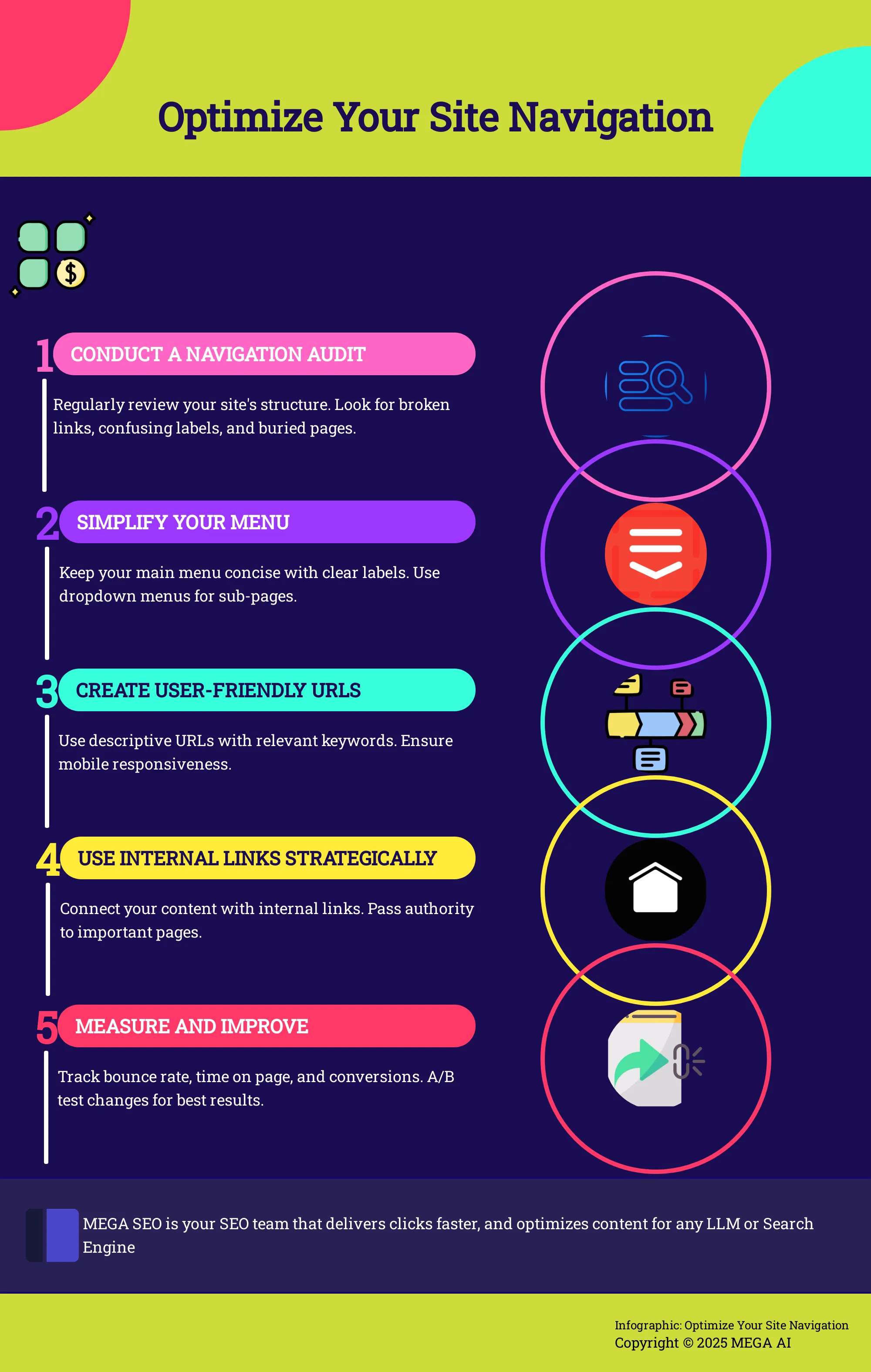
Conduct a Navigation Audit
Before you change anything, you need to understand what’s working and what isn’t. A navigation audit is a systematic review of your site's structure. Plan to check your website navigation every six to twelve months to keep your site current. During the audit, look for broken links, confusing menu labels, and important pages that are buried too deep. You can use tools like heatmaps to see where users click and session recordings to watch their journey. This data shows you exactly where people get stuck or confused, giving you a clear list of items to fix.
Simplify Your Menu Structure
When it comes to your main menu, less is more. A cluttered menu can overwhelm visitors. Aim to keep your primary navigation concise, with around four to seven essential items. Use clear, descriptive language that your audience understands instantly. For example, use “Contact Us” instead of “Get in Touch.” If your site has a lot of content, use logical dropdown menus to group related pages. This keeps your main navigation clean while still providing access to deeper sections of your site. The key is to make choices obvious for the user.
Create User-Friendly URLs
Your page URLs are a small but significant part of the user experience. A clean, descriptive URL tells both users and search engines what a page is about before they even click. For instance, a URL like yourwebsite.com/services/seo-audits is much more helpful than yourwebsite.com/page-id=891. Use keywords that accurately describe the page content. Similarly, when you link to other pages, use descriptive anchor text. Instead of "click here," use text that describes the destination, like "view our SEO packages." This practice improves usability and reinforces page topics for search engines.
Use Internal Links Strategically
Internal links are the threads that connect your content, creating a cohesive web that guides users and search engines through your site. A strong internal linking strategy helps search engines understand your site’s structure and the relationship between your pages. When you link from a high-authority page to another page on your site, you pass some of that authority along. You can use tools like MEGA AI's SEO platform to automatically identify linking opportunities and build a logical content hierarchy, ensuring your most important pages get the attention they deserve from both users and crawlers.
Common Navigation Mistakes to Avoid
Creating a clear path for users and search engines is a primary goal of site navigation. However, a few common missteps can create roadblocks, leading to frustrated users and lower search rankings. When users can't find what they're looking for, they often leave, which can increase your bounce rate. By steering clear of these frequent errors, you can build a more effective and user-friendly website structure that supports your SEO goals.
Overly Complicated Menus
A cluttered or confusing menu is one of the fastest ways to lose a visitor. When you present too many options, use multiple levels of dropdowns, or create a massive mega menu, you can cause decision paralysis. Users shouldn't have to work hard to figure out where to go next. Poor website navigation often leads to high bounce rates because people give up if the path isn't clear. Keep your main navigation menu clean and focused on the most critical pages. You can always use your website's footer for secondary links like careers, press, or investor relations.
Neglecting the Mobile Experience
More than half of all web traffic comes from mobile devices, so your navigation must be seamless on a small screen. A menu that works perfectly on a desktop can be clunky and difficult to use on a phone. Buttons might be too small to tap, or text might be unreadable. It's essential to design your navigation with mobile users in mind from the start. Use a responsive design that adapts to different screen sizes and test it thoroughly on actual devices, not just emulators. A positive mobile experience is no longer optional; it's a requirement for good SEO.
Using Non-Standard Designs
While creativity in web design is valuable, your site's navigation is not the place to reinvent the wheel. Users are accustomed to certain conventions, like finding the main menu at the top of the page and the logo in the top-left corner linking back to the homepage. Deviating from these standards can confuse visitors and create a poor user experience. When people have to search for your menu or learn a new system, it adds unnecessary friction. Stick to familiar, intuitive designs that make it easy for anyone to find their way around your site without a second thought.
Vague Labels and Illogical Order
The words you use in your menu are incredibly important. Vague labels like "Products" or "Resources" don't tell users or search engines much about the content on the page. Instead, use clear, descriptive terms that align with your keyword strategy, such as "AI Content Tools" or "Paid Ads Automation." The order of your menu items also matters. Placing your most important pages at the beginning of the navigation and arranging items in a logical sequence helps guide the user journey. An illogical order can confuse users and make your site feel disorganized.
How to Measure Your Navigation's Impact
Making changes to your site navigation without measuring the results is like shooting in the dark. You need to know if your updates are actually helping users and improving your site’s performance. Tracking the right metrics shows you what’s working and what isn’t, so you can make data-driven decisions instead of guessing. Effective navigation keeps users on your site longer, guides them toward a purchase, and signals to search engines that your site provides a quality experience.
Poor navigation can lead to frustrated users and lost business, so it's critical to monitor how people interact with your changes. By setting up the right tracking and analysis, you can connect your navigation improvements directly to positive outcomes like lower bounce rates, higher engagement, and better conversion rates. This process doesn't have to be complicated. With a few key metrics and the right tools, you can get a clear picture of your navigation’s performance and find opportunities for continuous improvement.
Key Metrics to Track
To understand your navigation's effectiveness, start by tracking a few core metrics. Your bounce rate—the percentage of visitors who leave after viewing only one page—is a major indicator. A high bounce rate on important pages could mean your navigation isn't guiding users to their next step. Also, look at the average time on page and pages per session. If these numbers go up after a navigation change, it suggests users are more engaged and finding more relevant content.
Another critical area to watch is your user flow. Tools like Google Analytics have reports that visualize the paths users take through your site. Are they following the intended journey, or are they getting stuck and dropping off? Finally, keep an eye on your conversion rate. Whether your goal is a sale, a form submission, or a signup, your navigation should make it easy for users to complete that action.
Tools to Analyze User Behavior
Quantitative data tells you what is happening, but qualitative tools can show you why. Heatmap tools like Hotjar or Crazy Egg are great for this. They create visual representations of where users click, move their mouse, and scroll on a page. This can reveal if users are trying to click on non-clickable elements or ignoring important menu items. Session recordings go a step further, letting you watch anonymized recordings of real user sessions to see exactly how they interact with your site.
For a more technical analysis, you can use site crawlers like Screaming Frog to check for broken links in your navigation or analyze your internal linking structure. Combining these insights with data from Google Analytics gives you a complete view of your navigation’s performance. MEGA AI's SEO tools can also help by automatically monitoring site health and performance metrics, alerting you to issues that might stem from poor navigation.
A/B Test Your Navigation Changes
Once you’ve identified a potential area for improvement, the best way to confirm your hypothesis is through A/B testing. This involves creating two versions of a navigation element—an "A" version (the original) and a "B" version (the variation)—and showing them to different segments of your audience to see which one performs better. You could test different menu labels (e.g., "Services" vs. "What We Do"), change the order of items, or try a completely different menu layout.
Tools like Google Optimize or VWO (Visual Website Optimizer) are built for this kind of experimentation. They handle the technical side of splitting your traffic and measuring the results against your goals, like increasing clicks on a key page or reducing the bounce rate. By A/B testing your changes, you can be confident that your updates are truly improving the user experience and contributing to your business objectives.
Weave Navigation Into Your SEO Strategy
Your website’s navigation is more than just a map for users; it’s a powerful tool in your SEO toolkit. When you treat navigation as a strategic asset, you provide clear signals to search engines about your site's structure and most important content. This helps them crawl your pages more efficiently and understand your topical authority. A well-planned navigation system works hand-in-hand with your content and keyword strategy, creating a cohesive structure that benefits both search engine bots and human visitors. By integrating these elements, you build a stronger foundation for organic growth.
Align Navigation with Your Keyword Strategy
The labels in your navigation menu are prime real estate for your most important keywords. Think of them as high-level signposts. When you use descriptive, keyword-rich labels for your main pages, you tell search engines exactly what those pages are about. This reinforces the page's topic and helps it rank for relevant terms. However, avoid stuffing your menu with long, clunky phrases. The goal is clarity. Crowded or confusing navigation can dilute your link equity and make it harder for search engine crawlers to find your key pages. A focused approach ensures your most valuable pages get the attention they deserve from both users and search engines, forming a core part of your SEO efforts.
Use Navigation to Build Content Silos
Effective navigation organizes your content into logical groups, often called content silos or topic clusters. This involves creating a clear content hierarchy where broad categories in your main menu lead to more specific sub-pages. For example, a path like "Services > SEO > Keyword Research" clearly shows the relationship between pages. This structure helps search engines understand that you have deep expertise in a particular subject, which can establish your site as an authority. By grouping related content together through your navigation, you make it easier for users to explore topics in-depth and for search engines to crawl and index your content systematically.
Balance SEO Goals with User Experience
While optimizing navigation for search engines is important, you can't forget the user. A menu that’s perfectly optimized for keywords but confusing for a human visitor will ultimately fail. Poor navigation leads to frustrated users, high bounce rates, and lost conversions—all signals that can harm your search rankings. The best approach finds a middle ground where navigation is both keyword-relevant and intuitive. Your primary goal should always be to help users find what they need quickly. A well-designed system builds trust and improves usability, which naturally supports your SEO performance. Tools that help you manage technical SEO can free you up to focus on creating this positive user experience, and you can always book a demo to see how automation can help.
How to Future-Proof Your Site Navigation
Building a website that lasts means creating a navigation system that can evolve. Future-proofing isn’t about predicting what the internet will look like in five years. It’s about building a flexible foundation that can adapt to new devices, changing user habits, and shifts in search engine algorithms. A static navigation structure will eventually feel dated and become a barrier for both users and search engine crawlers.
To keep your site relevant and effective, you need a proactive approach. This means staying informed about technological shifts, understanding what your audience expects from their online experience, and treating your site navigation as a living part of your digital strategy. By focusing on these key areas, you can create a navigation system that not only serves your users today but is also ready for the challenges of tomorrow.
Adapt to New Technology
The way people access information is always changing. Not long ago, designing for mobile was the big shift. Now, we have voice search, smart displays, and other interfaces to consider. Your navigation needs to be flexible enough to work across these platforms. This means moving beyond simple text links and thinking about how your site’s structure can be interpreted by different technologies. A well-organized content hierarchy is key, as it allows systems like voice assistants to understand and process your content effectively. Your goal is to ensure that no matter how a user finds you, they can easily find what they need.
Keep Up with User Expectations
What feels intuitive to a user today might seem clunky tomorrow. Users form an opinion about your site within seconds, and their expectations are shaped by their experiences across the web. A navigation system that feels familiar and straightforward builds immediate trust. This doesn’t mean you have to jump on every new design trend. Instead, focus on clarity and simplicity. Pay attention to how major platforms organize their information and conduct user testing to see what works for your specific audience. Meeting modern user expectations means creating a seamless experience that feels effortless.
Commit to Continuous Optimization
Your website navigation is not a one-and-done project. It requires regular attention to remain effective. Committing to continuous optimization means you are always looking for ways to improve. This involves regularly auditing your navigation, analyzing user behavior data to find points of friction, and testing changes. Improving website navigation is an ongoing process, but the payoff is a better user experience and stronger SEO performance. Tools that help you maintain and update content can simplify this process, ensuring your site structure stays aligned with both user needs and search engine requirements.
Related Articles
- Enhance Mobile Navigation for Better SEO & Engagement
- Boost Mobile SEO: Improve Navigation for Better Engagement
- Examine Techniques to Improve Navigation on Mobile Sites to Boost SEO and User Engagement - MEGA SEO | Blog
- Boost SEO Crawlability: The Ultimate Guide
- Site Navigation Benefits: Lower Your Bounce Rate
Frequently Asked Questions
How often should I review my website's navigation? A good practice is to perform a navigation audit every six to twelve months. You should also plan to review it anytime you make significant changes to your site, such as adding a new product line, launching a major content initiative, or completing a redesign. This ensures your navigation evolves with your business and continues to serve your users effectively.
What's the most common mistake to avoid with site navigation? The most frequent mistake is making the navigation too complicated. Overloading your main menu with too many options or deep dropdowns can overwhelm visitors and make it difficult for them to find what they need. This complexity also makes it harder for search engines to identify your most important pages. Always aim for simplicity and clarity.
Should I design my navigation for users or for search engines? You should always design for your users first. A navigation system that is intuitive and helpful for a person will naturally send positive signals to search engines. When users can easily find information, they stay on your site longer and engage more with your content, which search engines like Google interpret as signs of a high-quality website.
How can I tell if my navigation improvements are working? Look at user behavior metrics. After making a change, check to see if your bounce rate has decreased and if the average time on page has increased. You can also use user flow reports in analytics tools to see if visitors are moving through your site more logically and reaching key pages. If users are more engaged and completing goals, your changes are having a positive impact.
Do the links in my website's footer count as navigation? Yes, footer links are an important part of your site's navigation. While your main header menu should feature your most critical pages, the footer is the perfect place for secondary links. This can include pages like "About Us," "Careers," "Contact," or your privacy policy. Using the footer this way keeps your main menu clean while ensuring all pages are still accessible to both users and search engine crawlers.