
Creating a website that both users and search engines appreciate requires careful planning. One critical, yet sometimes overlooked, aspect is content hierarchy. This isn't just about making your pages look tidy; it's about structuring information so it's easily digestible for human visitors and clearly understandable for search engine crawlers. When users find your site intuitive and valuable, they stay longer, which is a positive signal. Exploring the benefits of content hierarchy establishment for reduced bounce rate? reveals how this strategic organization can improve user experience, keep visitors engaged, and even support your SEO efforts. We'll show you how to build a hierarchy that works effectively for both your audience and your visibility.
Key Takeaways
- Organize Information Logically: Position your most vital content at the top and use clear headings to guide readers. This makes it easier for both visitors and search engines to understand your page's main message.
- Make Content Easy to Scan: Use consistent formatting, helpful visuals, and ensure your layout works well on all devices. This approach helps visitors quickly find what they need, encouraging them to stay longer.
- Continuously Improve with Data: Review website analytics and gather user feedback to refine your content organization. A thoughtful hierarchy improves user satisfaction and can support better search engine visibility.
What is Content Hierarchy and Why Does It Matter?
Think of content hierarchy as the way you organize information on your website. It’s about putting the most important details right at the top, where visitors will see them first, and then arranging less critical information further down. Imagine an upside-down pyramid – the broadest, most essential points are at the wide top, and the more specific, detailed information tapers below. This structure helps people quickly understand the main message of your page before they decide to explore further.
So, why is this organization so important? A well-thought-out content hierarchy significantly improves the user experience. When your website is easy to understand and people can find what they need without fuss, they're more likely to have a positive impression. Visitors typically scan web pages starting from the top. If your information is presented in a clear, logical sequence, they can efficiently locate what they’re looking for. This clarity encourages them to stay on your site longer, which naturally helps to reduce your bounce rate.
Beyond keeping your visitors happy, a structured content hierarchy also plays a role in how search engines understand and value your pages. When users engage with your content and find it useful, they tend to spend more time on your site and are less likely to leave immediately. These positive user signals can contribute to better search rankings. Essentially, making your content accessible and logical for humans often makes it more favorable for search engines too.
How Content Hierarchy Impacts User Experience
A well-thought-out content hierarchy is fundamental to creating a positive user experience on your website. Think about how you interact with web pages; most people scan content quickly, often starting at the top and looking for cues to find the information they need. When your content is logically structured, visitors can easily understand what your page is about and locate specific details without frustration. This clarity makes your website feel intuitive and user-friendly, which is a big win for keeping people around.
Effective content hierarchy directly influences how long visitors stay on your site and how they interact with your content. When users can effortlessly find what they're looking for, they are more likely to spend more time on the page and engage more deeply with the material. This engagement signals that your content is valuable and relevant to their needs. Using clear headings (like H1, H2, H3 tags) and subheadings acts as visual signposts, guiding the reader's eye through the text and breaking down complex information into digestible chunks. This visual guidance helps users quickly assess if the content meets their expectations. A site that is easy for people to use is also often easier for search engines to understand, which can contribute to better visibility. Understanding user behavior through analytics can further refine your hierarchy, ensuring it aligns with how your audience actually consumes information.
How Content Hierarchy Reduces Bounce Rates
When a visitor lands on your page and quickly leaves, that’s a bounce. A high bounce rate can suggest that your content isn't meeting user expectations or is difficult to process. This is where a strong content hierarchy comes into play. By structuring your information logically, you make your content more inviting and easier for visitors to digest. This thoughtful organization directly influences a user's decision to stay and explore, or to hit the back button. A well-planned hierarchy guides them through your content, making their experience smoother and more valuable, which in turn encourages them to stick around longer. For businesses aiming to improve their online presence, understanding how to structure content is a fundamental step toward better user engagement and, consequently, improved search engine performance.
Improve Site Navigation and Information Discovery
Think of content hierarchy as the roadmap for your webpage. It involves arranging website information with the most crucial details placed prominently, often at the top, while supporting or less critical information follows in a structured manner. This principle isn't just for your main landing pages; it’s effective across all types of web content, including blog posts and even emails. When users can effortlessly find what they're looking for, their frustration levels drop significantly. Clear navigation paths mean they can quickly locate specific sections or answers, making them much less likely to abandon your page out of confusion or impatience. This improved information discovery is a key factor in keeping users engaged and on your site.
Enhance Readability and Scannability
Most people don't read web pages word-for-word, especially on their first visit. Instead, they scan pages, typically starting from the top and looking for cues that indicate relevance. A good content hierarchy makes your website easier to use and understand by breaking up text and highlighting key information. Elements like clear headings (H1, H2, H3), concise subheadings, bullet points, and shorter paragraphs transform a daunting wall of text into an approachable piece of content. This enhanced readability means users can quickly grasp the main points and decide if the content meets their needs, encouraging them to delve deeper rather than bouncing off to find a more accessible source.
Increase User Engagement and Time on Page
Ultimately, a well-structured content hierarchy leads to visitors who spend more time on the page and are less likely to leave immediately. When users find your content engaging and useful, signaled by a lower bounce rate, it tells search engines that your page is valuable. To achieve this, understanding user behavior through analytics and considering different user scenarios is vital for creating an effective hierarchy. By organizing content in a way that anticipates user needs and guides them logically, you increase their engagement. They are more likely to read further, click on internal links, and interact with your calls to action. For businesses looking to refine their content strategy, tools that help with SEO optimization can also assist in structuring content effectively to achieve these goals.
Key Elements of an Effective Content Hierarchy
Creating an effective content hierarchy isn't just about making your webpage look tidy; it's a strategic approach to structuring your information. When done well, both your readers and search engines can easily understand what your content is about and quickly find what they need. Think of it as drawing a clear map for anyone who lands on your page. The primary aim is to present information in a way that feels intuitive and keeps people engaged, which is crucial for reducing bounce rates.
Several core components work together to build a strong content hierarchy. These include clear and descriptive headings, the thoughtful use of visuals, and a logical flow of information, starting with the most important points. Each element plays a specific role in guiding the user’s eye and making even complex information easy to digest. When these pieces are correctly in place, your content becomes more accessible, your message is clearer, and your audience is more likely to stick around. For businesses using tools to automate SEO and content creation, understanding these foundational elements ensures that any AI-assisted content is structured for maximum impact right from the start. Ultimately, a well-considered hierarchy respects your reader's time and attention, contributing to a positive experience on your site.
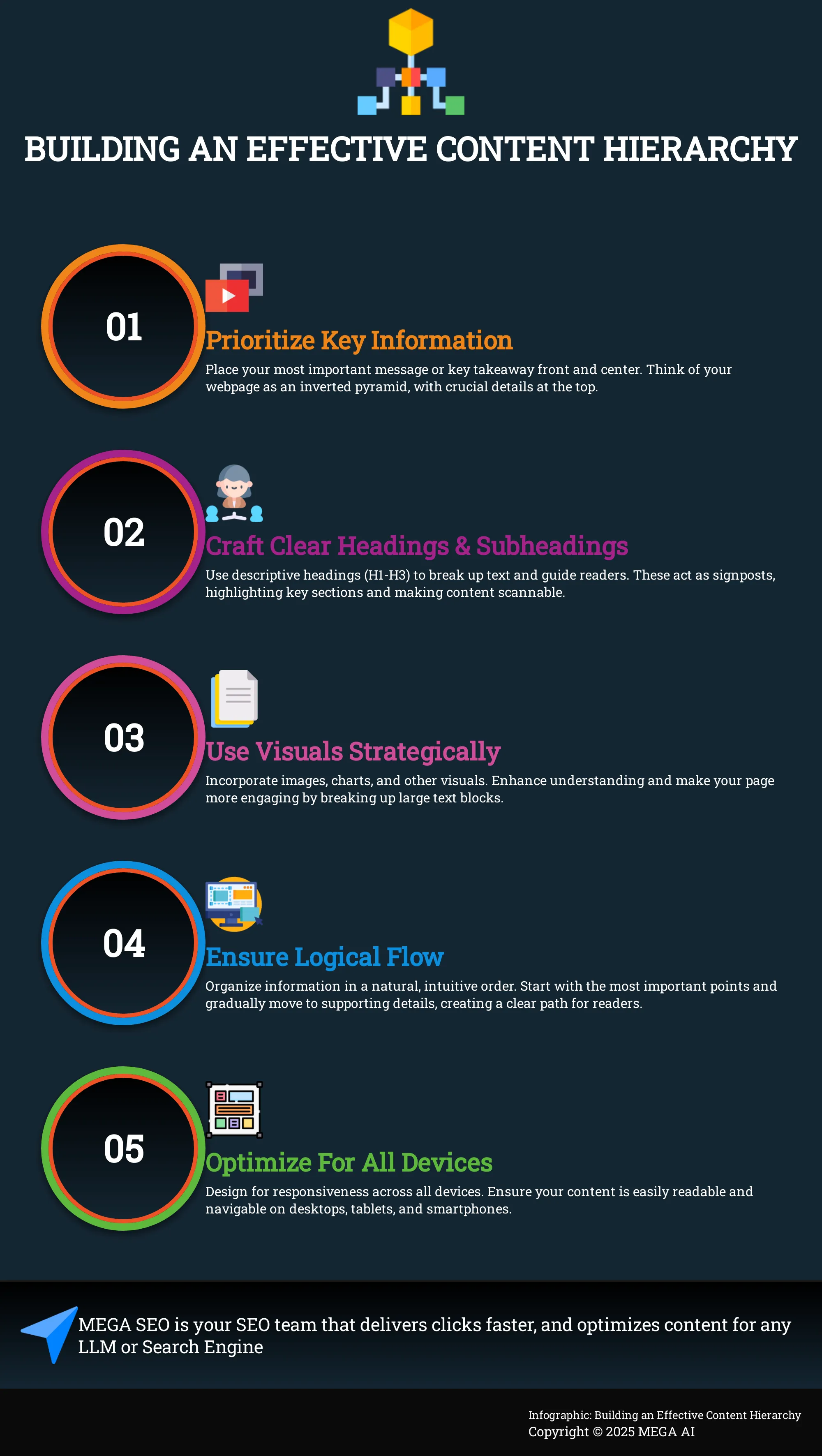
Write Clear Headings and Subheadings
Think of your headings and subheadings (H1, H2, H3, and so on) as the helpful signposts on your webpage. They do more than just break up long stretches of text; they "visually separate important information," as noted by Rock Content. This visual distinction helps readers quickly scan your content and identify the sections that are most relevant to their interests or questions.
It’s all about how you "arrange information on a webpage, putting the most important stuff first and organizing the rest logically." This logical structure is vital for maintaining reader engagement. When users can easily follow the flow of your ideas through clear, descriptive headings, they are more likely to understand your message and continue reading, rather than feeling overwhelmed and deciding to leave the page.
Use Visual Elements Strategically
Visuals are incredibly useful tools in your content hierarchy arsenal. When you "combine text with visuals (images, charts, etc.) to make the content more appealing and easier to understand," you cater to different learning preferences and make your page feel more dynamic. Visual elements can effectively break up long blocks of text, which can otherwise seem intimidating to readers and make them less inclined to read through.
Consider how you can "use images, bullet points, and tables to make it easier to read." These elements aren't just decorative; they significantly enhance comprehension and can make complex data or lists much more accessible. Strategically placed visuals keep your audience engaged, encouraging them to spend more time interacting with your content and absorbing your key messages. This is a straightforward yet effective method to improve the overall user experience on your website.
Ensure a Logical Information Flow
The way you organize information on your page greatly influences how users interact with it. An effective "content hierarchy is arranging website information with the most important details at the top and less important details lower down." This top-down approach aligns with how people naturally scan and consume online content, making it easier for them to find what they're looking for quickly.
As Bynder points out, "Good content hierarchy makes websites easier to use and understand. People scan pages, starting at the top." By placing your most critical information where it’s most likely to be seen first, you immediately demonstrate value to your visitors. This logical progression helps users quickly grasp the main points and move through the rest of the content with ease, making them less likely to become frustrated and leave your site.
Best Practices for Building Your Content Hierarchy
Creating a solid content hierarchy is about much more than just making your website look organized. It's a foundational element of a positive user experience and plays a crucial role in encouraging visitors to stay and explore what you offer. When your content is structured logically, users can find information effortlessly, which directly impacts how long they engage with your site and, importantly, helps reduce bounce rates. Think of it as creating a clear roadmap for your visitors, guiding them smoothly to their destination.
These best practices aren't just for seasoned web designers; they're actionable strategies that startups, small businesses, and marketing agencies can implement to make a real difference. A well-defined hierarchy doesn't just benefit your human visitors. It also provides clear signals to search engines, helping them understand the structure and importance of your content, which can subtly support your overall SEO efforts. By focusing on clarity and ease of use, you're building a stronger foundation for both user satisfaction and search visibility. We'll explore specific techniques you can use to build an effective content hierarchy that works hard for your website.
Prioritize Your Most Important Information
Think of your webpage as an inverted pyramid. As Rock Content aptly puts it, "Content hierarchy is arranging website information with the most important details at the top and less important details lower down." This means the very first thing your visitors encounter should be the most critical piece of information—your main message, a key takeaway, or the primary action you want them to take.
Users often make quick decisions when they land on a page. If they can't immediately grasp what your page is about or find what they're looking for, they're more likely to click away. Before arranging any elements, clearly identify the single most important objective for that page and ensure it's prominently displayed. This initial clarity is vital for capturing attention and can significantly improve user interaction from the moment they arrive.
Use Consistent Formatting Styles
Consistency in your formatting is a subtle but powerful aspect of user experience. This involves using uniform styles for your headings (H1, H2, H3), body text, links, and even button designs across your entire website. When you "hav[e] a standard format," as Rock Content notes, it not only "makes creating new content faster and simpler" for your team but also fosters a predictable and comfortable environment for your users.
Imagine reading a magazine where each article used different fonts and heading sizes—it would feel disjointed and make it harder to follow. The same principle applies to your website. A consistent visual language helps users intuitively understand how information is structured and where to find similar types of content. This makes your site feel more professional and easier to process, encouraging visitors to stay longer and explore further.
Create Scannable Page Layouts
Most people don't read web pages word for word; they scan for key information. According to Bynder, "Good content hierarchy makes websites easier to use and understand. People scan pages, starting at the top." Your goal is to make this scanning process as smooth as possible. Use clear, concise headings and subheadings to break your text into manageable sections. Short paragraphs, bullet points, and numbered lists are also excellent tools for this.
Strategically using bold text for important phrases can help draw the eye to critical details. Don't underestimate the value of white space; giving your content room to breathe makes it less visually overwhelming and much more inviting. When users can quickly scan your page and locate relevant information, they feel more in control of their experience and are less likely to leave. Utilizing tools for content generation can often help in structuring content for optimal scannability right from the start.
Optimize for All Devices
In today's mobile-centric world, ensuring your content hierarchy adapts effectively to smaller screens is absolutely essential. As Loop11 emphasizes, you need to "Make sure your website looks and works great on phones and tablets, as most people browse the internet on mobile devices." A layout that appears perfect on a desktop can easily become cluttered and difficult to use on a smartphone if not properly optimized.
This means your text must be readable without needing to zoom, buttons should be easy to tap with a finger, and navigation should remain intuitive regardless of screen size. If users are forced to pinch, zoom, and scroll excessively to make sense of your content on their mobile device, their patience will quickly wear thin. Regularly test your site's responsiveness and carefully consider how your content hierarchy adjusts across different devices. This is a critical component of technical SEO that directly influences user satisfaction and, consequently, your bounce rates.
Common Content Hierarchy Mistakes to Avoid
Getting your content hierarchy just right can feel like a puzzle, and it's easy for a few pieces to go astray. Don't worry, these are common learning curves, and recognizing them is the first step to improvement. One frequent hiccup is when your website's navigation isn't as clear as it could be. If visitors find your menus confusing or the overall site structure hard to follow, they might feel lost and decide to leave before they unearth the gems you're offering. Think of your navigation as the friendly guide at the entrance of a museum; it should make exploration easy and inviting, not a frustrating maze.
Another area to watch is how your content itself is structured and presented on the page. Sometimes titles or descriptions promise one thing, but the page delivers another, which can be a quick turn-off for visitors expecting something specific. Inconsistent heading use, or worse, not using headings (your H1s, H2s, H3s) to break up text, can also make your valuable information look like an intimidating wall of words. People love to scan online, so clear headings help them quickly grasp what’s important and decide if the content is relevant to them. Similarly, if a website is visually cluttered or presents usability issues, visitors are less likely to stick around, no matter how fantastic the underlying information might be.
Finally, remember to gently guide your visitors toward what you'd like them to do next. A common oversight is failing to place calls to action prominently. If someone loves what they read but isn't sure what the next step is—like learning more, signing up for a newsletter, or getting in touch—you might miss a valuable connection. It's also key to approach your content with a plan, ensuring it truly meets the needs of your audience and aligns with what they're actually searching for. When your content directly answers their questions and solves their problems, they're much more likely to stay, engage, and ultimately convert.
Tools to Analyze and Improve Content Hierarchy
Figuring out the best content hierarchy for your website isn't a shot in the dark. Thankfully, there are several tools and methods you can use to analyze your current setup and make data-driven improvements. These approaches help you understand how users interact with your content and identify areas where a stronger hierarchy can make a real difference in keeping them on your site longer. By systematically evaluating and refining your content structure, you can create a more intuitive and engaging experience for your visitors. Many platforms, including MEGA AI, offer features that can assist in analyzing content performance, which indirectly points to hierarchy effectiveness. This process is about understanding user flow and making sure your most valuable information is easy to find and digest.
Leverage Website Analytics
Your website analytics platform, such as Google Analytics, is an excellent starting point. You can examine reports to see which pages have high bounce rates or low average time on page. These metrics often indicate that visitors aren't finding what they expect, or that the content is difficult to process – both potential signs of a less-than-optimal hierarchy. For instance, if a key service page shows a surprisingly high bounce rate, it might be because the information isn't structured clearly, or the most important details aren't immediately visible. Use this data to pinpoint problem areas where your content hierarchy might be lacking and requires a closer look.
Conduct User Research
Analytics tell you what is happening on your site, but user research helps you understand why. Combining quantitative data with qualitative insights from your audience provides a much fuller picture. Consider creating user personas or mapping out common user scenarios to better grasp your audience's needs and how they typically search for information. You can gather direct feedback through surveys, user interviews, or even simple usability tests where you ask users to perform specific tasks on your website. This understanding of user expectations and pain points is invaluable for designing a content structure that truly serves them and makes information accessible.
Experiment with A/B Testing
Once you have some ideas for improving your content hierarchy, A/B testing is a practical way to validate them. This involves creating different versions of a page—perhaps with varied heading structures, different layouts, or an altered flow of information. Then, using A/B testing tools, you can show these different versions to segments of your audience. By tracking key metrics like bounce rate, time on page, and conversion rates for each version, you can objectively see which hierarchy performs best. This method allows you to make informed decisions based on actual user behavior, helping you determine which layout most effectively keeps visitors engaged and guides them toward your goals.
Identify Popular Content with Analytics
Your analytics can also reveal which pieces of content are already performing well with your audience. Look for pages that consistently draw high traffic, keep users engaged for longer periods, and achieve good conversion rates. This popular content often holds clues about what your users find valuable and how they prefer information to be presented. You can then use these insights to inform your overall content hierarchy strategy. For example, you might make this high-performing content more prominent or model the structure of other, less successful pages after these proven examples, helping you highlight your most engaging material.
Set Clear, Measurable Goals
Before you begin making significant changes to your content hierarchy, it's important to define what success will look like. What specific outcomes are you hoping to achieve? Perhaps you're aiming to reduce the bounce rate on key landing pages by a certain percentage, increase the average time users spend on your site, or improve conversion rates for particular calls to action. Setting clear, measurable goals provides a benchmark against which you can assess the effectiveness of your adjustments. This allows you to track progress systematically and make further refinements based on performance metrics, ensuring your efforts lead to tangible improvements in user experience and potentially even search rankings.
How to Measure Content Hierarchy's Effect on Bounce Rates
Once you've structured your content with a clear hierarchy, the next step is to see if it's actually working to keep visitors on your site. Measuring its effect on bounce rates isn't just about looking at one number; it involves understanding specific metrics and how users are interacting with your pages. This insight helps you refine your approach and ensure your content hierarchy effectively guides users, encouraging them to stay longer and engage more deeply. Let's look at how you can track this.
Key Metrics to Monitor
To understand how your content hierarchy is performing, you'll want to keep a close eye on a few key numbers. The most direct indicator is your bounce rate. This metric tells you the percentage of visitors who land on a page and then leave without interacting further or visiting any other pages on your site. Think of it this way: a high bounce rate often signals that visitors aren't quickly finding what they expected, or the page isn't compelling enough to encourage them to explore further.
A consistently high bounce rate can suggest there are issues with your website's ability to meet user needs or maintain their interest. When people stick around longer, it generally means they're engaging with your content, which is a positive step towards achieving your website's goals, like making a sale or getting a sign-up. Monitoring this helps you gauge if your content structure is truly making it easier for users to find value.
Analyze User Behavior Patterns
Beyond the numbers, it's helpful to understand how users interact with your pages. People typically scan web content, looking for specific information quickly. If your key messages aren't easy to spot due to a confusing hierarchy, visitors might leave out of frustration or disinterest. Website analytics tools are invaluable here; they can show you which pages have higher bounce rates and sometimes offer insights into user pathways or where they drop off.
Don't be afraid to experiment with A/B testing different layouts or heading structures to see what resonates best with your audience. Ultimately, a deeper understanding of user behavior, perhaps through heatmaps or session recordings, will guide you in refining your content hierarchy for better engagement and lower bounce rates. This information allows you to make data-driven decisions to improve the user journey on your site.
Balance SEO and User Experience in Your Content Hierarchy
Finding the right balance between search engine optimization (SEO) and user experience (UX) is really important when you're setting up your content hierarchy. Essentially, what helps your readers usually helps search engines too. A well-organized website is simpler for search engines to crawl and understand, which can lead to better search rankings and more visitors. Plus, a clear structure helps your visitors find what they need quickly, encouraging them to stay on your site longer and reducing the chances they'll leave out of frustration.
One practical way to achieve this balance is by using headings (like H1s, H2s, and H3s) thoughtfully. These headings aren't just for breaking up text; they create a logical flow that guides both your visitors and search engine crawlers. When people land on your page, they often scan for information that's relevant to them, usually starting at the top. Clear, descriptive headings act like signposts, helping them quickly decide if your page has what they're looking for. For SEO, placing relevant keywords naturally within your headings and the main text tells search engines what your content is about, which can improve its visibility. Tools like MEGA AI's SEO features can assist you in finding these keywords and structuring your content effectively. Keep in mind, you generally have only a short window to capture a visitor's interest, so making your content easy to follow is key to keeping them engaged.
Related Articles
- Backlink-Free SEO: A Startup's Guide to Organic Growth
- Site Navigation Benefits: Lower Your Bounce Rate
- Content Decay: What It Is & 5 Ways to Fix It
- Mastering the Helpful Content Update (HCU) in 2024
- Top Content Optimization Tools for Better SEO Results
Frequently Asked Questions
What's the main idea behind content hierarchy? Think of content hierarchy as organizing your webpage information from most important to least important. You place the key message or main takeaway at the top so visitors grasp it immediately, with supporting details following in a logical order.
Why should I care about how my content is organized on a page? How you organize content directly affects how easily visitors can understand and find what they need on your site. A clear structure makes your website more user-friendly, encouraging people to stay longer and engage with your information, which can also be favorable for search engines.
What are a couple of practical things I can do to improve my content hierarchy today? Start by using clear, descriptive headings and subheadings (like H1, H2, H3) to break up your text and guide readers. Also, ensure your most vital information appears at the top of the page where it's most visible.
Can better content structure really stop people from leaving my site so quickly? Yes, a well-thought-out content structure can help reduce how quickly people leave your site. When information is easy to find and digest, visitors are less likely to get frustrated and more likely to continue exploring your page.
How do I make sure my content hierarchy works well for both search engines and actual people? The good news is that what helps people usually helps search engines. Focus on creating a logical flow with clear headings and relevant keywords used naturally. This makes your content easy for visitors to scan and understand, while also providing clear signals to search engines about your page's topic and structure.