You can have the best product in your niche, but if your product page isn't converting visitors into customers, your business can't grow. Staring at metrics like a high bounce rate or a low conversion rate can be frustrating if you don't know which levers to pull to fix the problem. Optimizing a product page isn't about guesswork; it's about making strategic, data-informed changes based on how real users interact with your site. This article moves beyond theory and provides a practical framework for improvement. We'll cover how to write compelling copy, structure your page for search engines, and use social proof to build credibility and guide users toward making a purchase.
Key Takeaways
- Write for your customer, not just for search engines: Your page's success hinges on persuasive copy. Start with compelling meta-tags and benefit-focused descriptions, then build confidence with authentic social proof like customer reviews and user-generated photos.
- Design a frictionless visual and mobile experience: Since shoppers can't physically touch your product, use high-quality images and videos to create a rich virtual experience. Ensure the page loads quickly and has a clear, mobile-friendly layout to keep users engaged.
- Treat optimization as a continuous process: A high-converting page requires ongoing attention. Use a smart internal linking strategy and technical SEO to improve visibility, then consistently monitor analytics and run A/B tests to make data-driven decisions that improve performance over time.
What Makes a High-Converting eCommerce Product Page?
A high-converting product page does more than just list features. It tells a story, answers questions before they're asked, and makes the path to purchase feel effortless. Think of it as your best salesperson, working 24/7 to turn browsers into buyers. The goal is to create an experience that is both informative and persuasive, guiding the user smoothly from interest to action.
The foundation of a great product page rests on a few key pillars. It starts with compelling visuals—high-quality images and videos that show your product in its best light from every angle. This is paired with clear, persuasive product descriptions that go beyond specs to highlight real benefits. To build confidence, you need social proof. Authentic customer reviews and ratings act as powerful endorsements that can significantly influence a purchasing decision.
Beyond the content, the user experience is critical. The page must load quickly and look great on any device, especially mobile. A clear, prominent call-to-action (CTA) button removes any guesswork about what to do next, while transparent pricing prevents last-minute surprises. Every element, from the layout to the language, should work together to build trust and reduce friction. When these components are in sync, they create a seamless journey for the customer. In the following sections, we'll break down specific, actionable tweaks you can make to each part of your product page to improve its performance and drive more sales.
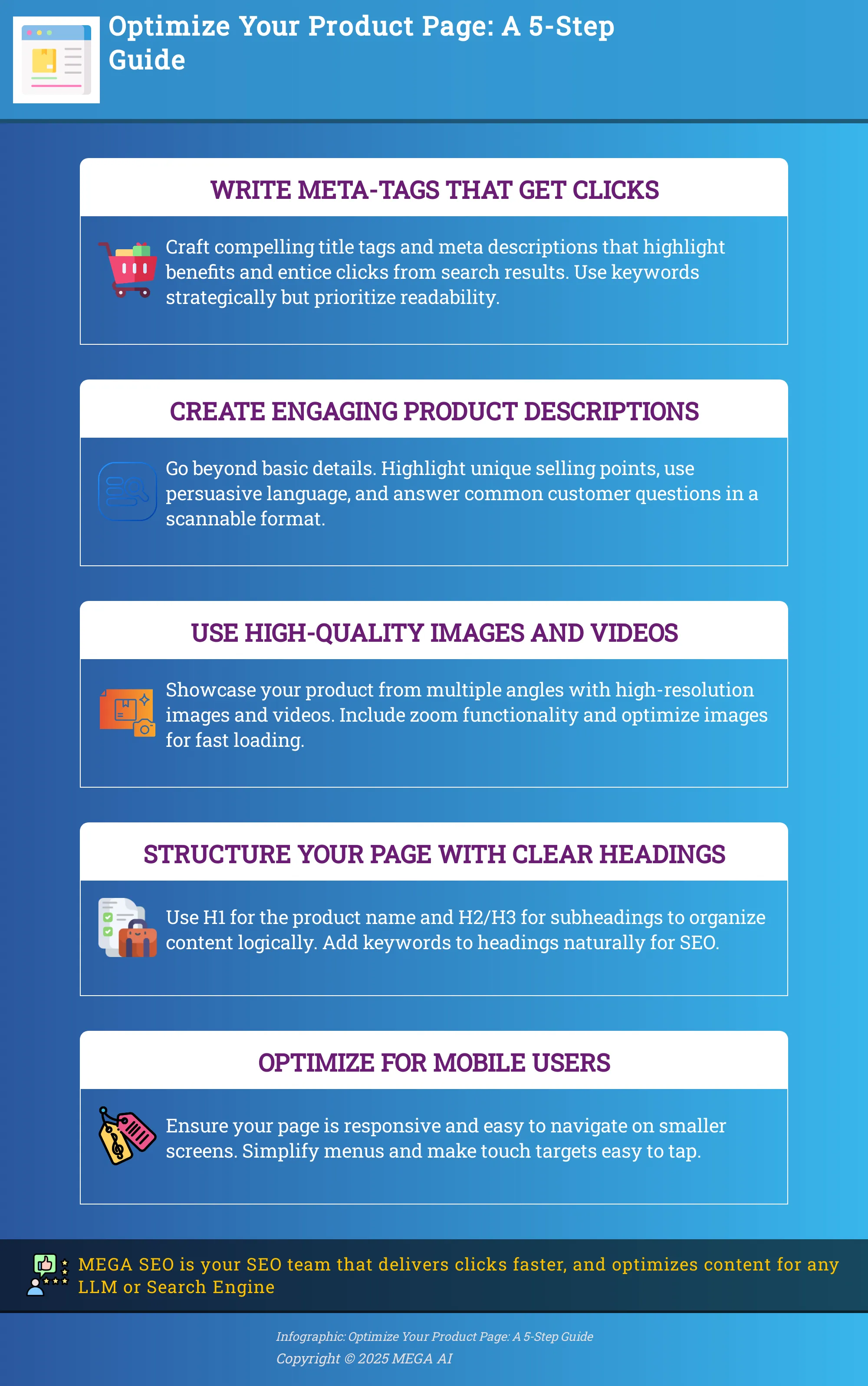
1. Write Meta-Tags That Get Clicks
Your product page's first impression happens long before anyone lands on your site. It takes place on the search engine results page (SERP), where your listing competes for attention against a dozen others. Your title tag and meta description are your digital storefront window—your first and sometimes only chance to convince a potential customer to click. If they aren't compelling, even the most beautifully designed product page will go unseen. Writing effective meta-tags is a foundational step in driving qualified traffic that's ready to convert.
These small pieces of text signal relevance to search engines and persuade users that your product is exactly what they need. Getting them right means more clicks from the right people, which is the first step toward a sale. Think of it as the opening line in a conversation; it needs to be interesting enough to make someone want to hear more. This is where you bridge the gap between a user's search query and the solution your product offers. A well-crafted meta-tag set not only improves your click-through rate but also pre-qualifies your visitors, ensuring the people who land on your page are genuinely interested in what you're selling.
Write compelling title tags
Your title tag is the main clickable headline in search results. It needs to be attractive and immediately communicate value. Instead of just stating the product name, frame it around the user's needs. Go beyond the "what" and include the "why." Think about the primary benefit or feature that makes your product stand out. A good title tag clearly identifies the product while also hinting at the solution it provides, all while staying under the 60-character limit to avoid getting cut off in search results.
- Before: Blue Suede Shoes
- After: Men's Blue Suede Shoes | Classic Style & Handcrafted Comfort
Create click-worthy meta descriptions
The meta description is the short paragraph of text below your title tag in search results. While it doesn't directly impact rankings, it has a huge influence on click-through rates. This is your chance to expand on the promise made in your title tag. Use this space—about 155 characters—to summarize the product's key benefits and give users a compelling reason to choose your page over others. Use active language and tell the user what makes your product the best choice for them. Think of it as the ad copy for your search listing. It should answer the user's unspoken question: "Why should I click on this link?"
Use keywords strategically
Including your main keyword in your title tag and meta description is essential. It signals to both search engines and users that your page is relevant to their search query. Try to place your primary keyword near the beginning of the title tag for better visibility. However, avoid stuffing keywords unnaturally. The goal is to write for humans first and search engines second. Your copy should be persuasive and readable. Using a tool for automated keyword research can help you identify the exact phrases your customers are using, ensuring you connect with their intent.
A/B test your meta-tags
You don't have to settle for your first draft. The best way to find out what resonates with your audience is to test different versions. By running A/B tests on your title tags and meta descriptions, you can gather data on which variations earn the most clicks. You can track your click-through rate (CTR) for specific pages in Google Search Console to see how your changes perform. Continuously improving your meta-tags is a simple but powerful way to increase traffic. Some platforms can even update content automatically to improve CTR based on performance data, taking the guesswork out of optimization.
2. Create Engaging Product Descriptions
Your product description is more than just a label; it’s your digital salesperson. It’s your chance to connect with a potential buyer, answer their questions, and show them why your product is the right choice. A great description bridges the gap between a simple online listing and a compelling offer that customers can’t refuse. It works hand-in-hand with your meta-tags to not only attract shoppers but also to persuade them to click “add to cart.”
Writing descriptions that sell requires a blend of creativity, psychology, and strategy. You need to understand your audience, highlight what makes your product special, and present the information in a way that’s both scannable and convincing. When done right, your descriptions can significantly improve your conversion rates. Tools that assist with content generation can streamline this process, helping you craft compelling copy that resonates with your target audience and search engines alike. Let’s walk through the key elements of a product description that converts.
Highlight unique selling points (USPs)
Your unique selling points are what set your product apart from the competition. Before you write a single word, identify what makes your item special. Is it made from a sustainable material, handcrafted by artisans, or designed with a specific problem-solving feature? These are the details that justify a purchase.
Clearly listing these features helps customers understand exactly what they’re getting. As marketing expert Neil Patel notes, pointing out specific features not only drives more search traffic but also helps with conversions. Instead of using generic phrases like “high quality,” be specific. For example, change “durable fabric” to “tear-resistant ripstop nylon designed for rugged outdoor use.” This level of detail builds confidence and gives customers a concrete reason to choose you.
Use persuasive language
The words you choose have a direct impact on a customer’s decision. Your goal is to move beyond simple descriptions and use persuasive language that creates an emotional connection. Focus on the benefits, not just the features. How will your product make the customer’s life better, easier, or more enjoyable? Paint a picture of the experience they’ll have.
To do this, use sensory words that appeal to touch, taste, sight, and sound. A description for a coffee blend could mention its “rich, chocolatey aroma” and “smooth, full-bodied flavor.” This approach helps customers imagine themselves using the product, which, as Shopify experts point out, is key to creating a personalized shopping experience that builds brand confidence and drives sales.
Answer common customer questions
When customers shop online, they can’t pick up the product or ask a salesperson a question. Your product description must do that work for them. Think about every possible question a customer might have and answer it preemptively. What size is it? What materials is it made of? How do you clean it? What does it come with?
Anticipating these questions reduces friction and uncertainty, making customers more comfortable with their purchase. A great way to find these questions is to read through your existing customer reviews, support emails, and social media comments. This feedback is a goldmine of information that can help you address common concerns directly on the product page, building trust with new visitors.
Use bullet points for readability
Online shoppers rarely read every word on a page. Most people scan for key information. Walls of text are intimidating and can cause potential buyers to leave your site. This is where bullet points become essential. They break down complex information into short, digestible pieces that are easy to scan.
Use bullet points to list your product’s most important features, specifications, and benefits. This format allows customers to quickly understand the key takeaways without having to read a dense paragraph. According to eCommerce best practices, this simple formatting choice makes your page more user-friendly, especially for mobile shoppers who are viewing your content on a small screen.
Balance SEO with a great user experience
A product description needs to serve two masters: search engines and human readers. While it’s important to include relevant keywords so customers can find your product, it’s even more important that the description is readable and persuasive. Keyword stuffing will only hurt your user experience and can even get you penalized by search engines.
The best approach is to write for your customer first. Focus on creating a clear, compelling, and helpful description. Then, naturally weave your primary and secondary keywords into the copy, headings, and bullet points. The goal is to create a seamless experience where the SEO elements are invisible to the reader. This balanced approach improves both your search visibility and your on-page engagement, leading to higher conversion rates.
3. Use High-Quality Images and Videos
Since online shoppers can’t physically touch or inspect your products, high-quality visuals are the next best thing. They are your most powerful tool for bridging the gap between the digital shelf and the customer's hands. Great images and videos do more than just show what a product looks like; they build trust, answer unasked questions, and help customers visualize how the item will fit into their lives. Think of your product page as a virtual showroom. You want to create an experience that is as informative and engaging as possible.
High-quality images and videos can significantly enhance the shopping experience, allowing customers to see the product in detail and from different angles. This isn't just about having one or two pretty pictures. It's about creating a comprehensive visual narrative that covers every feature, use case, and detail. From detailed close-ups to videos of the product in action, each visual element should serve a purpose: to inform the customer and move them closer to making a purchase. Neglecting your visuals means leaving sales on the table, as customers will simply go to a competitor who gives them the confidence to click "add to cart."
Show products from multiple angles
One of the biggest hesitations for online shoppers is uncertainty. Will the product look the same in person? What does the back look like? To overcome this, provide a gallery of images that showcases your product from every conceivable angle. Include front, back, side, top, and bottom views. Add close-up shots to highlight specific features, textures, or materials. It's also effective to include "in-context" or lifestyle photos that show the product being used. This helps customers understand its scale and visualize how they might use it themselves. The goal is to leave no room for doubt and give shoppers a complete picture of what they’re buying.
Add a zoom feature
A zoom feature is a standard expectation on modern eCommerce sites for a reason. It allows customers to get up close and personal with your product, mimicking the experience of examining an item in a physical store. Including a zoom feature allows customers to examine the product closely, which can help alleviate concerns about quality and details. This is especially important for products where texture, material, and craftsmanship are key selling points, such as clothing, furniture, or jewelry. A high-resolution zoom function builds confidence and transparency, assuring customers that you have nothing to hide and are proud of your product’s quality. This small detail can significantly reduce purchase anxiety and lead to higher conversions.
Include product demonstration videos
Static images are great, but videos can take your product page to the next level. A well-made video can demonstrate features and benefits far more effectively than text or photos alone. Product demonstration videos can provide customers with a better understanding of how to use the product, which can lead to increased confidence and higher conversion rates. Consider creating short videos that show the product in action, an unboxing experience, or a tutorial on how to use it. Videos not only capture attention but also help customers connect with your product on an emotional level, making it easier for them to imagine owning it.
Optimize images for fast loading
High-resolution images are essential, but they can’t come at the expense of page speed. Slow-loading pages are a major conversion killer. In fact, optimizing images for fast loading is crucial, as slow-loading images can lead to higher bounce rates and lost sales. You need to find the right balance between image quality and file size. Use tools to compress your images without a noticeable drop in quality, and choose modern file formats like WebP that offer superior compression. Implementing lazy loading, where images further down the page only load as the user scrolls, is another effective technique. Ensuring your visuals load quickly is a critical part of your site's technical SEO and overall user experience.
4. Structure Your Page with Clear Headings
Think of your product page like a well-organized report. Clear headings and subheadings act as a table of contents, guiding both your customers and search engine crawlers through the information. When a visitor lands on your page, they aren't likely to read every single word. Instead, they scan for the details that matter most to them—features, specifications, or shipping information. A logical structure makes this process effortless, improving the user experience and keeping potential buyers on your page longer.
For search engines, headings create a clear hierarchy of information. The main heading (H1) signals the page's primary topic, while subheadings (H2, H3, etc.) organize supporting details into thematic groups. This helps search algorithms understand your content's context and relevance to user queries, which is a key factor in how your page ranks. By structuring your page thoughtfully, you create a win-win: a better experience for your customers and improved visibility in search results. Automating your SEO can help ensure all your product pages follow these best practices without manual effort.
Use H1 tags for the product name
The H1 tag is the title of your page and the single most important heading. It should be reserved for your product name. This simple practice sends a clear signal to both users and search engines about the page's main focus. When a visitor arrives, seeing the product name in a large, prominent heading immediately confirms they’re in the right place.
From an SEO perspective, the H1 tag carries significant weight. Search engines use it as a primary indicator of the page's content. Including your main product name here is a fundamental step in on-page optimization. Using an H1 tag for the product name is essential because it clearly defines the page's purpose, which is a foundational element of any successful product page strategy.
Use H2 and H3 tags to structure content
Once you have your H1 in place, use H2 and H3 tags to break your content into smaller, scannable sections. Long blocks of text can be intimidating and cause visitors to leave. Instead, group related information under clear subheadings like "Product Features," "Specifications," "How to Use," or "Customer Reviews." This approach makes your page much easier to digest.
This structured format allows customers to quickly find the information they need, which is critical for making a purchase decision. This method enhances readability and improves the overall user experience. By organizing content logically with H2s and H3s, you cater to the natural scanning behavior of online shoppers, making your page more effective and user-friendly.
Add keywords to your headings
Your headings offer a valuable opportunity to reinforce your page's SEO. Beyond your product name in the H1, try to include relevant keywords in your H2 and H3 tags where it feels natural. For example, instead of a generic "Features" heading, you could use "Key Features of Our Waterproof Hiking Boot." This helps search engines better understand the specific details of your product.
This practice can significantly improve your page's ranking by signaling relevance for a wider range of search queries. Just be careful not to force keywords where they don't belong, as this can make your content sound unnatural and harm the user experience. The goal is to provide context for search engines while keeping the headings clear and helpful for your human visitors.
Keep formatting consistent
Consistency in your formatting is key to creating a professional and trustworthy online store. Ensure that all your H1s, H2s, and H3s have a uniform look across all your product pages. This means using the same font family, size, and color for each heading level. When your site looks clean and organized, it builds subconscious trust with your audience.
Inconsistent formatting can make a page feel messy and unprofessional, which might cause potential customers to question your brand's credibility. Maintaining a consistent visual hierarchy helps users navigate your site more intuitively and reinforces your brand identity. This small detail contributes to a polished user experience that can make a big difference in how shoppers perceive your business.
5. Optimize for Mobile Users
With more people shopping on their phones than ever before, your product page must perform flawlessly on a small screen. A clunky mobile experience is a fast way to lose a sale. Optimizing for mobile users isn't just about making your site accessible; it's about creating a smooth and intuitive path to purchase, no matter the device. This means focusing on how your page looks, feels, and functions in the palm of your customer's hand. Let's walk through three key areas: responsive design, simplified navigation, and easy-to-use touch targets.
Use a responsive design
A responsive design ensures your product page automatically adjusts its layout to fit any screen, from a wide desktop monitor to a smartphone. This is non-negotiable for eCommerce. When your site is responsive, images resize correctly, text remains readable, and your layout doesn't break, providing a consistent experience for every visitor. Most modern website themes are built to be responsive, but it's always smart to check if your site is mobile-friendly. A seamless design builds trust and keeps users engaged, preventing them from bouncing to a competitor with a better mobile site.
Simplify navigation on small screens
Navigating a complex site on a phone can be frustrating. Your goal is to make finding information and completing a purchase as simple as possible. Start by streamlining your menus; a clean hamburger menu is standard for a reason. Prioritize what users see first by placing key details like the product name, price, and Add to Cart button above the fold. Think about reducing the number of taps needed to get from the product page to checkout. Every extra step is a potential drop-off point, so a clear and intuitive mobile navigation path is essential for conversions.
Make touch targets easy to tap
Have you ever tried to tap a tiny link on your phone and hit the wrong one? It’s a common frustration that can quickly lead a customer to abandon your page. Touch targets—the clickable areas like buttons, links, and form fields—need to be large enough for a finger to tap accurately. Pay special attention to your 'Add to Cart' button, size or color selectors, and checkout links. Ensuring there is enough space around each element prevents accidental clicks and makes the shopping experience feel effortless. Following mobile accessibility guidelines for target size is a great practice that benefits all users.
6. Build Trust with Social Proof and UGC
Shoppers trust other shoppers far more than they trust brand advertisements. This is the power of social proof. By showcasing authentic feedback and content from real customers, you build credibility and make it easier for new buyers to trust your products. User-generated content (UGC) like reviews, photos, and videos provides the unbiased validation that people look for before making a purchase. Integrating these elements directly onto your product pages can significantly reduce hesitation and guide customers toward the checkout.
Display star ratings clearly
Star ratings are a visual shortcut that customers use to quickly assess product quality. When a shopper lands on your page, one of the first things they often look for is that familiar row of stars. Displaying these ratings prominently near the product title and price can have a major impact on purchasing decisions. For the best results, place them "above the fold" so they are visible without scrolling. Implementing review schema markup also allows these star ratings to appear in Google search results, which can improve your click-through rate from organic search.
Encourage detailed customer reviews
While star ratings offer a quick glance, detailed reviews provide the substance that helps shoppers make informed choices. These reviews often answer specific questions and address concerns that your product description might not cover. You can encourage customers to leave reviews by sending a polite follow-up email a week or two after their purchase. Asking specific questions like "How did the fit work for you?" or "What was your favorite feature?" can prompt more descriptive feedback. This detailed social proof builds a strong case for your product and supports your overall SEO performance.
Respond to reviews to build trust
Engaging with customer reviews—both positive and negative—shows that you are an attentive and customer-focused brand. A simple "thank you" on a positive review shows appreciation and encourages others to share their good experiences. More importantly, a thoughtful and professional response to a negative review demonstrates accountability. It gives you a public platform to resolve an issue and show potential customers that you stand behind your products and are committed to a positive experience. This interaction builds a layer of trust that a static page of positive-only reviews cannot achieve.
Feature user-generated photos and videos
Featuring photos and videos from your actual customers adds a powerful layer of authenticity to your product pages. While professional photos are essential, UGC shows your product in real-life situations, helping new buyers visualize how it will look and function for them. This kind of content feels more genuine and relatable, which can increase a shopper's confidence and their likelihood of making a purchase. You can collect this content by creating a branded hashtag on social media or by allowing customers to upload images directly with their reviews.
7. Guide Users with Internal Links
A product page shouldn't be a dead end. When a customer lands on a page, you want to give them clear paths to discover other relevant items in your store. This is where internal linking comes in. A smart internal linking strategy guides users to related products, helps them understand where they are on your site, and makes it easier for search engines to crawl and index your entire inventory.
Think of internal links as the hallways connecting the rooms of your store. They create a seamless shopping experience that keeps customers engaged and encourages them to explore. For search engines, these links build a map of your site, showing how different pages relate to one another and passing authority between them. This helps improve your overall site structure and can lead to better rankings for your product pages. Manually creating and managing these links can be time-consuming, which is why tools that offer automated internal linking can be a huge help for busy store owners. By connecting your pages thoughtfully, you create a better journey for your customers and a clearer roadmap for search engines.
Link to related products
One of the most effective ways to use internal links is to showcase related or complementary products. Sections like “You might also like” or “Complete the look” are powerful tools for cross-selling and upselling. They introduce shoppers to items they might not have found otherwise, which can increase your average order value. This strategy also has significant SEO benefits. When you cross-link between products, you help search engines discover and index more of your pages. This signals that your pages are interconnected and valuable, which can help them rank higher in search results, driving more organic traffic to your store.
Add links to categories and subcategories
Imagine a customer lands on a product page directly from a Google search. They like the product, but it’s not quite right. If there are no easy links to see similar items, they’ll likely hit the back button and leave. By including links to the product’s parent category and relevant subcategories, you give them an easy way to continue browsing. This simple navigational aid improves the user experience by helping shoppers explore your offerings more broadly. It also reinforces your site’s hierarchy for search engines, making it clear how your products are organized and helping to distribute link authority across your site.
Use breadcrumbs for navigation
Breadcrumbs are a navigational trail, usually at the top of a page, that shows a user’s path to their current location (e.g., Home > Apparel > T-Shirts > Your Product). This small feature is incredibly helpful for user experience. It allows shoppers to easily retrace their steps and jump back to a previous category with a single click, preventing frustration and reducing bounce rates. For search engines, breadcrumbs provide another clear signal about your site’s structure. Implementing them is considered one of the best practices for optimizing eCommerce product pages because it benefits both your customers and your SEO.
Improve site structure for search engines
All of these internal linking tactics—linking to related products, categories, and using breadcrumbs—work together to create a strong, logical site structure. A well-organized site is easier for search engines to crawl, understand, and index efficiently. This means more of your pages get discovered and have a better chance of ranking. A solid structure also helps spread ranking power throughout your site. When one page gains authority, it can pass some of that strength to other pages it links to. Consistently applying these principles is key to product page optimization and establishing your brand as a leader in your niche.
8. Keep Users Engaged to Reduce Bounce Rate
A user landing on your product page and leaving immediately is a missed opportunity and a negative signal to search engines. A high bounce rate can suggest your page isn't meeting user expectations. The key is to capture their attention the moment they arrive and hold it with a page that’s informative, easy to use, and trustworthy. When users spend more time on your page, they are not only more likely to convert, but they also send positive ranking signals to Google, which can improve your visibility over time.
Keeping your product pages engaging over the long term involves more than just a one-time setup. It requires a commitment to regularly updating content to keep it fresh and relevant. For instance, adding a section that answers new customer questions or updating product benefits based on recent reviews can make a significant difference in how users perceive your product. This ongoing optimization is crucial. Tools like MEGA AI's Maintenance Agent can help by identifying new content opportunities to enrich your existing pages, ensuring they continuously meet user needs and perform well in search. By focusing on engagement, you create a better user experience that directly supports your conversion goals.
Provide compelling, informative content
Your product description is your digital salesperson. It needs to be more than a simple list of specs; it must be compelling enough to convince a visitor they need your product. Start by clearly articulating the product's unique selling points and how they solve a specific problem for your customer. Use persuasive, benefit-driven language that helps the shopper imagine the product in their life. Think less about what the product is and more about what it does for them. Answering common questions directly within the description can also remove purchase barriers and build confidence. This approach ensures your content is not just optimized for search engines but is genuinely helpful to your audience.
Add interactive elements
Static pages with just text and a few images are no longer enough to capture a user's attention. Interactive elements invite shoppers to engage with your product on a deeper level. High-resolution image galleries with zoom functionality, 360-degree product views, and demonstration videos allow customers to explore the product from every angle, much like they would in a physical store. These features help answer questions that text alone cannot, such as texture, scale, and real-world application. By making your page more dynamic, you encourage users to spend more time exploring, which can significantly reduce bounce rates and increase the likelihood of a purchase.
Ensure navigation is clear and simple
When a potential customer lands on your product page, they shouldn't have to search for essential information. A confusing layout leads to frustration and a quick exit. Your page structure should be intuitive, with key elements like the product title, price, images, and "Add to Cart" button placed above the fold. Make sure product options like size or color are easy to select. Optimizing these core elements creates a seamless and personalized shopping experience that builds customer confidence. Simple navigation isn't just about one page; use breadcrumbs to show users where they are on your site and give them an easy path back to category pages.
Use clear calls-to-action (CTAs)
Your call-to-action is the final step in guiding a user from browsing to buying. A CTA must be clear, concise, and impossible to miss. Use strong, action-oriented text like "Add to Cart" or "Buy Now" instead of passive phrases. The button itself should stand out from the rest of the page using a contrasting color, drawing the user's eye directly to the desired action. While you might have secondary CTAs like "Add to Wishlist," your primary goal is the sale, so that button should always be the most prominent. An effective CTA removes any guesswork for the shopper, making the path to purchase feel effortless and straightforward.
9. Optimize Page Load Speed and Technical SEO
A slow-loading page is one of the fastest ways to lose a customer. If your product page takes more than a few seconds to appear, shoppers will likely click away before they even see your amazing products. Page speed isn't just about user experience; it's also a critical ranking factor for search engines like Google. A faster site can lead to better visibility and more organic traffic.
Technical SEO goes beyond speed. It involves structuring your page's data so search engines can easily understand and index it. This includes things like using schema markup to tell Google the price, availability, and review rating of your product, which can help you earn rich snippets in search results. While "technical SEO" might sound intimidating, many of these optimizations are straightforward to implement. Automating these tasks with a platform that handles technical SEO improvements can also free you up to focus on other parts of your business, ensuring your site stays fast and well-structured without constant manual effort.
Compress images without losing quality
High-resolution product photos are essential, but they are often the biggest culprits behind slow page speeds. Large image files take a long time to download, which can frustrate visitors. The goal is to find a balance between image quality and file size. You can significantly reduce file size by compressing your images before uploading them to your site. Many online tools and plugins can compress images without a noticeable drop in quality. Using modern image formats like WebP can also provide high-quality images at much smaller file sizes compared to traditional formats like JPEG or PNG. This simple step ensures your pages look great and load quickly.
Minimize HTTP requests
Every single element on your product page—each image, stylesheet, and script—requires an HTTP request to the server. The more requests a browser has to make, the longer your page will take to load. You can reduce these requests by simplifying your page design. A key strategy is to combine files. For instance, you can merge multiple CSS or JavaScript files into a single file. This reduces the number of individual requests the browser needs to make. While this can get technical, many Shopify themes and caching plugins are designed to handle this automatically, helping you streamline your site's performance without needing to code.
Use browser caching
Browser caching is a clever way to speed up your site for repeat visitors. When someone visits your product page for the first time, their browser can be instructed to save certain files, like your logo, CSS files, and some images, locally on their computer. When they visit your site again, their browser can load these files from its local cache instead of re-downloading them from your server. This process makes subsequent page loads much faster. Most modern content management systems and web hosting platforms have simple settings to enable browser caching, making it an easy win for improving user experience and encouraging customers to return.
Use lazy loading for images
If your product page has many images, especially further down the page, they don't all need to load at once. Lazy loading is a technique that defers the loading of images until a user scrolls down to them. This means only the images visible on the screen are loaded initially, which greatly improves the initial page load time. The rest of the images load as they are needed. This not only makes the page feel faster to the user but also saves bandwidth for both you and your visitor, particularly on mobile devices. Many modern eCommerce themes have lazy loading built-in, or you can add it with a simple app or plugin.
Add schema markup
Schema markup is a type of code you add to your website to help search engines understand your content more effectively. For a product page, you can use it to explicitly define details like the product name, price, brand, star ratings, and availability. When search engines have this structured data, they can display it as "rich snippets" directly in the search results. Seeing a product's price and rating before even clicking can make your listing stand out and improve your click-through rate. While you can add schema markup manually, many SEO tools and platforms can automate this process, ensuring your products are perfectly represented in search.
10. Monitor, Analyze, and Continuously Improve
Launching your product page is just the beginning. The most successful eCommerce stores treat their pages as living documents that evolve with customer feedback and behavior. Optimizing your product page is not a one-and-done task; it’s a continuous cycle of monitoring performance, analyzing data, and making strategic improvements. This ongoing process ensures your pages remain effective, competitive, and aligned with what your customers want.
By dedicating time to analysis and testing, you move from guessing what works to knowing what works. Each of the following steps provides a different lens through which to view your page’s performance, giving you the insights needed to make impactful changes that drive conversions and grow your business.
Track key metrics like conversions and bounce rate
To understand how your product page is performing, you need to track the right data. Start with two fundamental metrics: conversion rate and bounce rate. Your conversion rate is the percentage of visitors who complete a desired action, like making a purchase. A low conversion rate can signal that something on the page is preventing customers from buying.
The bounce rate tells you the percentage of visitors who leave your site after viewing only one page. A high bounce rate on a product page might indicate that the content doesn't match what the user expected from a search result or ad. Regularly monitoring these eCommerce analytics in a tool like Google Analytics helps you spot problems early and measure the impact of any changes you make.
Use heatmaps to see how users behave
Metrics give you the "what," but heatmaps can show you the "why." Heatmaps are visual tools that show where users click, how far they scroll down the page, and what elements they hover over the most. This information is incredibly valuable for understanding user engagement. For example, a heatmap might reveal that customers are repeatedly clicking on an image that isn't a link, indicating they expect more information there.
By using heatmaps, you can identify which parts of your page are getting attention and which are being ignored. This allows you to place your most important elements, like your call-to-action button or key product benefits, where they are most likely to be seen and clicked.
Run regular A/B tests
A/B testing, or split testing, is the most reliable way to determine what changes improve your page’s performance. The process involves creating two versions of your page (Version A and Version B) and showing them to different segments of your audience to see which one converts better. You can test almost any element, from your product headline and description to your images and CTA button color.
For clear results, it’s best to test one change at a time. For instance, test a new headline before you test a new product photo. This principle of continuous testing is what powers MEGA AI's SEO Maintenance Agent, which automatically refines content to improve its performance over time.
Stay current with eCommerce trends
The digital marketplace is always changing. New technologies, shifting consumer behaviors, and evolving design standards mean that what works today might be outdated tomorrow. Staying informed about the latest eCommerce trends is essential for keeping your product pages fresh and effective.
Make a habit of reading industry publications, following marketing blogs, and seeing what your competitors are doing. Are they using augmented reality to let customers "try on" products? Have they integrated new payment options like "buy now, pay later"? Adapting to these changes ensures your store provides a modern, convenient shopping experience that meets and exceeds customer expectations.
Related Articles
- Boost eCommerce Sales with Proven Content Optimization Tips
- PageOptimize: Boost E-commerce Sales with AI
- 7 Online Clothing Store Description Samples That Convert
- SEO Multimedia Optimization: A Guide to Boosting Content
- Ultimate Guide to E-commerce Mobile Optimization in 2024
Frequently Asked Questions
I'm just starting out. What are the first three things I should focus on for my product page? If you're feeling overwhelmed, start with the fundamentals that have the biggest impact. First, focus on your product visuals. Ensure you have several high-quality images from different angles and a clear video if possible. Second, write a compelling product description that highlights the benefits and answers common questions. Finally, make sure your "Add to Cart" button is prominent and easy to find on both desktop and mobile.
How can I get more customers to leave reviews? The most effective way to get more reviews is to simply ask. Set up an automated email to go out a week or two after a customer receives their order. Keep the message brief and polite, explaining that their feedback helps both your business and future shoppers. Including a direct link to the product review form removes friction and makes it more likely they will participate.
My product page is slow. What's the most common reason and how do I fix it? The most common cause of a slow product page is large, uncompressed image files. High-resolution photos are essential, but they need to be optimized for the web. Before uploading any images to your site, run them through an image compression tool to reduce their file size without sacrificing visual quality. This single step can dramatically improve your page load speed.
Is it better to write for search engines or for people? You should always write for people first. Your primary goal is to connect with a potential customer and give them the confidence to make a purchase. When you write clear, helpful, and persuasive copy, you will naturally use the keywords and phrases that are relevant to your product. Search engines are sophisticated enough to reward pages that provide a great user experience, so focusing on your customer ultimately benefits your SEO.
How often should I update my product pages? There isn't a strict schedule, but it's a good practice to review your most important product pages at least once a quarter. Look for opportunities to keep the content fresh. You can add new information based on recent customer questions, update photos with user-generated content, or refine the description to better highlight a popular feature. This continuous improvement keeps your pages relevant for both customers and search engines.