
Your website has a job to do: attract visitors, engage them, and guide them towards a specific action, whether that's making a purchase, signing up for a newsletter, or requesting a demo. Content hierarchy is the strategic framework that helps your site achieve these objectives. It involves structuring your information—text, images, and calls-to-action—in a clear, logical order of importance. This thoughtful organization makes it simpler for users to navigate, understand your key messages, and see the value you offer. When the path is clear, visitors are far more likely to convert. Exploring the benefits of content hierarchy establishment for increased conversion rates? reveals how this fundamental aspect of web design can transform your site from a passive brochure into an active sales tool.
Key Takeaways
- Enhance User Journeys and Search Visibility: A well-organized content hierarchy makes your website intuitive for visitors and easier for search engines to crawl and index effectively.
- Organize Information with Purpose: Implement a clear structure using descriptive headings and logical flow to guide visitors naturally toward your key messages and conversion points.
- Iterate Based on User Behavior: Regularly review how users interact with your site and test changes to your content organization to continually improve their experience and your conversion rates.
What is Content Hierarchy and Why Does It Matter for Your Website?
Think of your website's content hierarchy as its organizational backbone. It's the way you arrange information so that the most important content is easy to find, typically positioned at the top, while less critical details are placed further down. Imagine a pyramid – the most crucial information sits at the peak, guiding your visitors. This structure isn't just about looking neat; it's fundamental to how users interact with your site and how search engines understand it.
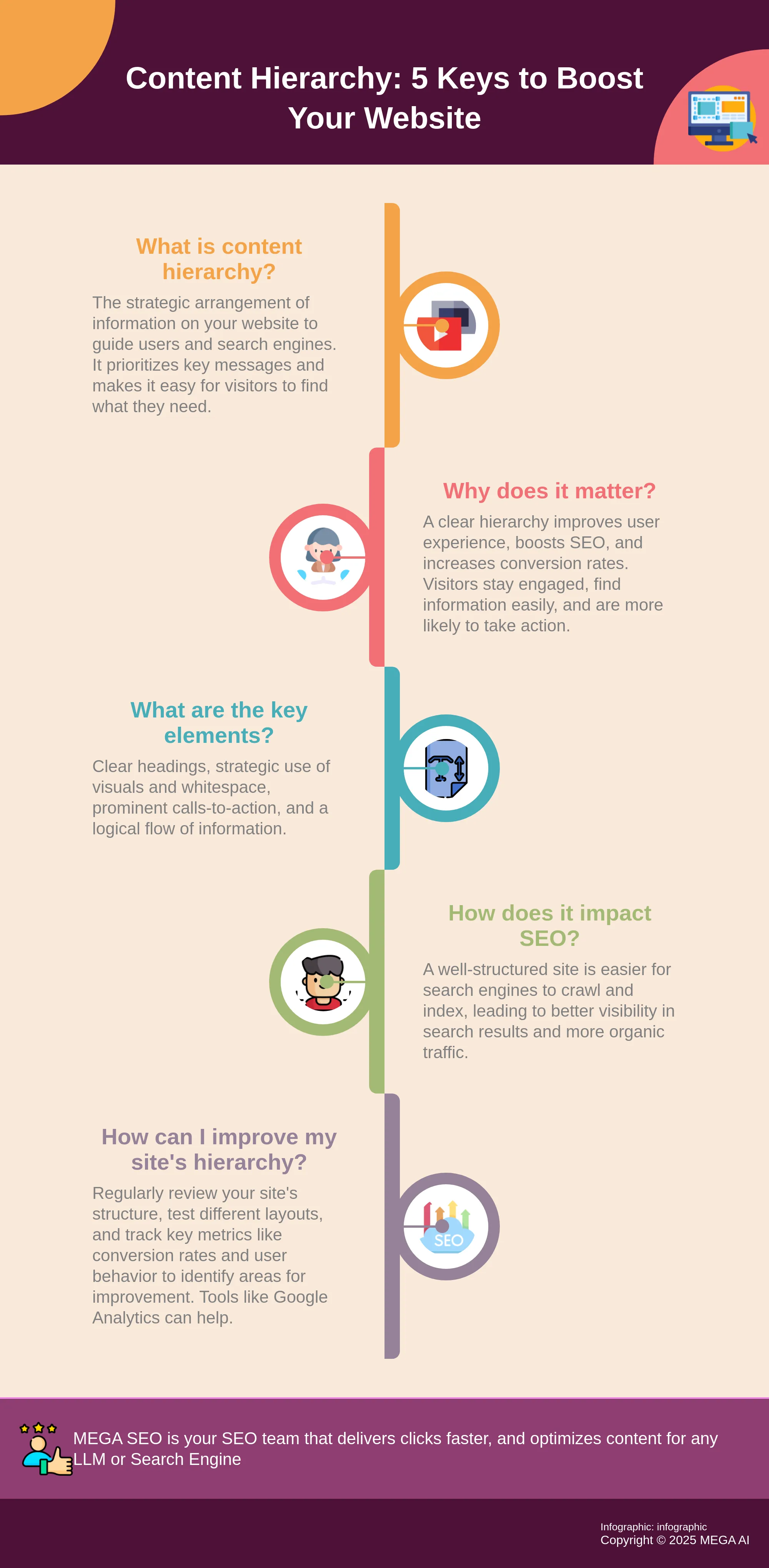
A well-thought-out content hierarchy significantly enhances user experience (UX), makes your site more friendly to search engines for better SEO, and can even improve your conversion rates. When users can quickly find what they're looking for, they're more likely to stay engaged. For search engines, a clear hierarchy helps them crawl and understand your site’s structure and the relationship between different pieces of content, which can positively impact your rankings.
Beyond functionality, a consistent content hierarchy lends a professional appearance to your website. This polished look can build trust and strengthen brand recognition among your visitors. Most people tend to skim web pages, so highlighting the most important information through a clear hierarchy is essential. You often have just a few seconds to capture a visitor's attention, making effective content organization incredibly important for keeping them on your site and guiding them toward your goals. Ultimately, by emphasizing key information through strategic placement and formatting, a strong content hierarchy can lead to improved conversion rates.
How Content Hierarchy Shapes User Experience and Engagement
Content hierarchy is much more than just arranging elements on a page to look organized; it’s a cornerstone of how users interact with your website. When you thoughtfully structure your content, you’re essentially creating a clear path for your visitors, making their journey through your site smoother and more intuitive. This directly influences how long they stay, how deeply they engage with your material, and, importantly, whether they take the actions you hope for, like making a purchase or signing up for a newsletter. A well-organized page shows respect for your user's time and attention, which fosters a much more positive overall experience.
Improving Navigation and Information Discovery
Think of a clear content hierarchy as a well-marked trail for your website visitors. It helps them find their way around your page with ease, allowing them to quickly locate the specific information they are looking for. When key details are highlighted, perhaps using larger fonts or strategic placement, users don’t have to guess where to look next. This is vital because if your website feels confusing or difficult to explore, people are unlikely to stick around, regardless of how excellent your actual content might be. A logical structure ensures that your valuable information is readily accessible, not buried.
Enhancing Readability and Comprehension
Most people don’t read web pages word-for-word; they tend to skim for key information. A strong content hierarchy accommodates this behavior by breaking up text and emphasizing the most important takeaways. Using clear headings and subheadings (such as H1s for main titles, H2s for major sections, and H3s for subsections) makes your content significantly easier to scan and digest. This approach greatly improves the user experience, ensuring readers can quickly grasp the main points, understand your message, and engage more deeply. It also helps search engines better interpret the structure and relevance of your site's content.
How Content Hierarchy Directly Improves Conversion Rates
A well-thought-out content hierarchy does more than just make your website look organized; it plays a crucial role in turning visitors into customers. Think of it as the friendly guide on your webpage, gently leading users to where they need to go and making it easy for them to take the actions you want them to, whether that’s signing up for a newsletter, requesting a demo, or making a purchase. When information is presented clearly and logically, users can effortlessly understand your message and see the value you offer. This smooth experience keeps them engaged and significantly increases the chances they’ll follow through on a call to action.
Essentially, a strong content hierarchy streamlines the user's journey. Instead of feeling lost or overwhelmed, visitors can quickly find what they’re looking for and understand the next steps. This clarity is key because a confused user is unlikely to convert. By strategically arranging your content, you're not just improving aesthetics; you're actively paving the way for higher conversion rates and, ultimately, business growth. It’s about making the path to conversion as simple and intuitive as possible. When users can easily process information and identify key takeaways, they are more likely to trust your brand and feel confident in their decision to engage further. This structured approach helps build that trust by demonstrating professionalism and a clear understanding of user needs.
Guiding Users Towards Desired Actions
One of the primary ways content hierarchy impacts conversions is by effectively guiding users. When you establish a clear content hierarchy, you help users move through the page with ease. By using visual cues like larger fonts for headlines, bold text for key phrases, or strategic placement of important elements, you ensure that users see the most critical information first. This naturally directs their attention and steers them towards the actions you want them to take. It’s not about manipulation, but rather about providing a clear, intuitive path. When the next step is obvious and appealing, users are far more likely to take it, leading directly to an increase in conversions.
Reducing Cognitive Load and Decision Fatigue
A well-structured content hierarchy significantly enhances the user experience by making information digestible. When visitors land on a page that’s easy to scan and understand, they can quickly find what they need without feeling overwhelmed. This reduction in cognitive load is vital because it allows users to conserve their mental energy for making important decisions, like whether to purchase your product or service, rather than spending it trying to decipher a cluttered page. If users don’t have to work hard to understand your content, they’re less likely to experience decision fatigue and abandon your site. A smoother, less demanding experience keeps them engaged and more receptive to your calls to action.
Prioritizing Key Messages and Calls-to-Action
Effective content hierarchy means arranging your website's information in order of importance. This ensures your most crucial messages and calls-to-action (CTAs) are prominent and easily noticeable. This prioritization of content makes it simple for both users and search engines to understand what your page is about and what you want users to do. When your key selling points are clear and your CTAs are strategically placed—at points where people are likely to take action—users are more likely to engage. It’s about presenting the right information at the right time to drive conversions.
Key Elements of an Effective Content Hierarchy
An effective content hierarchy isn't just about an organized look; it's about strategically guiding visitors and search engines. When key elements work together, they create a seamless experience that can significantly influence user behavior and conversion rates. Let's look at the core components of a strong content hierarchy.
Headings and Subheadings
Think of headings and subheadings (like H1, H2, H3 tags) as the signposts on your webpage. They break down content into digestible sections, making it easier for people to scan and find information. This structure is a fundamental aspect of content hierarchy, arranging website information by importance. Clear headings benefit readers and help search engines understand your page's main topics, crucial for SEO. Using them correctly makes content accessible and better positioned to rank. Well-structured headings allow tools like MEGA AI's SEO features to better analyze and optimize your content. Indeed, it's vital to "use clear headings and subheadings (H1, H2, H3) to make your content easy to read and understand. This helps both people and search engines."
Visual Elements and Whitespace
While content hierarchy primarily focuses on words, visual elements play a vital supporting role. "Visual hierarchy uses design elements (size, color, etc.) to emphasize important information," working with your textual structure, as detailed in discussions on visual hierarchy. This means using font sizes, bold text, colors, and imagery to draw attention to key content, like benefits or calls to action. Equally important is whitespace, or the empty space around text and images. "Leaving some empty space on your website makes it look cleaner and easier to read," according to design best practices. Whitespace prevents clutter, reduces cognitive load, and helps users focus, making the experience more pleasant.
Strategic Content Placement and Formatting
Where you place content, and how you format it, directly impacts its effectiveness. This includes the strategic placement of calls to action (CTAs). You should "place calls to action (CTAs, like buttons that say 'Buy Now' or 'Learn More') at points where people are likely to take action. Don't put them too early or too late." This means understanding the user's journey and prompting them when they're most receptive. Beyond CTAs, consistent formatting like bullet points and short paragraphs improves readability. When these elements are thoughtfully combined, "a good content hierarchy improves user experience (UX), search engine optimization (SEO), and conversion rates." People can find information quickly, and search engines better understand your site.
Building a Strong Content Hierarchy: Essential Practices
A strong content hierarchy is key to guiding users and helping search engines understand your site. When your structure is clear, visitors have a smoother journey, which can really help your conversion rates. Let's look at essential practices for building a hierarchy that works.
Use Clear and Descriptive Headings
Your headings (H1, H2, H3) are like signposts for your readers and for search engines. Using clear, descriptive headings makes your content much easier to scan, allowing people to quickly find the information they're looking for. This not only improves the user experience but is also vital for search engines to effectively index your content. Your main H1 should capture the core topic, while H2s and H3s break it down into logical, digestible sections. Remember to weave in keywords naturally, but always put clarity for your human audience first.
Organize Content Logically and Prioritize Key Information
A well-organized website presents information in an order that feels natural to the user, placing the most important details where they are easy to find. This logical arrangement is fundamental for a positive user experience, as it helps people move through your site without confusion. When users can quickly locate what they need, they're more likely to stay engaged. This structured approach also benefits your SEO, allowing search engines to better understand how your content pieces relate to each other. Always think about what your audience needs most and make sure that information is prominent.
Make CTAs Accessible and Prominent
Your calls-to-action (CTAs) are the gateways to conversion, so they need to be both visible and persuasive. A thoughtfully structured content hierarchy will naturally guide users toward these important buttons. Don't be afraid to experiment with the design of your CTAs; elements like size, color, and placement can significantly influence conversion rates. Ensure your CTA text is straightforward and action-oriented, clearly telling users what to expect when they click. Position them strategically at points where users are likely ready to take the next step.
Optimize for Mobile Devices
With so many people browsing on their phones, ensuring your website is mobile-friendly is absolutely essential. Your content hierarchy needs to translate seamlessly to smaller screens. A responsive design that automatically adjusts your layout for different devices is crucial for a good user experience and can lead to better conversion rates. If your site is difficult to read or navigate on a mobile device, visitors are likely to leave. Focus on clear text, easy navigation, and distinctly tappable CTAs to keep your mobile audience engaged and on the path to conversion.
How Content Hierarchy Influences SEO and Visibility
A well-thought-out content hierarchy does more than just make your website look neat and tidy; it's a cornerstone of effective Search Engine Optimization (SEO). While a positive user experience is a significant benefit, the influence of your site's structure extends deep into how search engines perceive, crawl, and ultimately rank your content. When search engines like Google can easily understand the thematic connections between your pages and the overall focus of your site, your chances of appearing higher in search results for relevant queries increase substantially. This improved visibility translates directly into more organic traffic—visitors who are actively searching for the information or products you offer.
Think of your content hierarchy as the architectural blueprint for your website. A clear and logical blueprint allows search engine crawlers to navigate your site efficiently, discovering all your valuable pages, from broad category pages down to specific blog posts or product listings. This crawlability and indexability are fundamental; if search engines can't find or understand your content, it simply won't appear in search results, no matter how well-written or relevant it is. Conversely, a confusing or disorganized structure can lead to crawler traps, orphaned pages, and diluted authority, all of which can hinder your SEO performance. By strategically organizing your content, you're essentially speaking the search engine's language, making it easier for them to recognize your site's expertise and relevance. We'll explore how aligning this structure with your keyword strategy and ensuring optimal crawlability are key to unlocking better search visibility.
Aligning Hierarchy with Your Keyword Strategy
Your content structure should work hand-in-hand with your keyword strategy. It’s not enough to just have great content; that content needs to be organized in a way that makes sense to both users and search engines. When your website is difficult to use or information is buried, people are less likely to stick around, no matter how good your articles or product descriptions are. This is where understanding user intent becomes critical.
Knowing what your audience is searching for allows you to structure your content to provide answers quickly and effectively. Your hierarchy should reflect the terms and phrases your ideal customers use. For instance, if you sell eco-friendly cleaning supplies, your top-level categories might reflect broad keyword terms like "natural kitchen cleaners" or "sustainable bathroom products." Subsequent pages would then target more specific, long-tail keywords. Tools like MEGA AI's SEO platform can assist in identifying these crucial keywords, helping you build a hierarchy that directly addresses what your users want to find.
Improving Website Crawlability and Indexing
A logical and clear website structure is essential for search engines to effectively crawl and index your content. When search engine bots can easily move through your site, understanding the relationship between different pages, it positively impacts your site’s ability to rank. This improved crawlability means your new and updated content gets indexed faster, making it visible in search results sooner.
Using clear headings and subheadings (like H1, H2, H3 tags) is a fundamental part of this. These tags create a semantic structure for your content, making it easier for both people to read and for search engines to understand the main topics of each page. Think of H1 as the main title of a book, H2s as chapter titles, and H3s as sub-sections within those chapters. This organization helps search engines determine the relevance of your page to specific search queries. Ensuring your existing content is well-structured, perhaps by using a service that can optimize content, is a key step in enhancing its visibility.
Measuring Success: Content Hierarchy and Conversion Rates
Creating a thoughtful content hierarchy is a significant first step, but how do you truly know if it’s working effectively for your business? The answer lies in carefully measuring its impact, especially on your conversion rates. It’s one thing to organize your content logically; it’s another to confirm that this organization helps your audience find what they need and moves them closer to becoming customers. Understanding how users interact with your structured content—whether it smoothly guides them towards your desired actions or inadvertently creates friction—is absolutely essential.
When you consistently track the right metrics, you uncover valuable insights into what’s resonating and what needs a second look. This data-driven approach means you’re not just guessing; you’re making informed decisions to continuously refine your content hierarchy. The goal is to ensure it not only provides an excellent user experience but also directly supports your core business objectives, like generating leads or sales. By systematically connecting the dots between your content structure and its performance, you can optimize your website’s ability to turn visitors into loyal customers and make the most of your content creation efforts. This focus on measurement isn't just about numbers; it's about understanding your audience better and serving them more effectively.
Key Metrics to Track
To understand how well your content hierarchy is performing, you’ll want to keep an eye on a few specific numbers. First, consider your Lead to Customer Conversion Rate. This metric shows you how many of the people who show initial interest actually become paying customers. A well-organized content hierarchy should smoothly guide users through this journey.
Next, delve into Conversion Rate Optimization (CRO) Metrics. These indicators help you pinpoint where visitors are successfully converting or where they might be encountering roadblocks on your pages. Analyzing these can reveal if your content structure is effectively steering users toward taking those key actions you want them to complete. Finally, remember the value of A/B Testing. This involves creating different versions of elements like headlines or calls-to-action to see which performs better. It’s a practical way to test changes to your content hierarchy and gather data on what truly resonates with your audience.
Helpful Tools for Analysis
Fortunately, you don’t have to guess how your content hierarchy is performing; there are excellent tools available to help you gather and analyze data. Various Website Structure Analysis Tools can offer deep insights into how users behave on your site, how your pages are performing, and other SEO-related metrics tied to your hierarchy. These tools can help you visualize how users move through your content and identify areas for improvement.
A primary goal of a good content hierarchy is to enhance user experience, making navigation intuitive and information easy to find. Tools that analyze user engagement can show you if your structure is achieving this. For many, Google Analytics is an indispensable tool. The latest version, GA4, provides even more detailed insights into how visitors interact with your website. Understanding this quantitative data can highlight how your content organization directly impacts user journeys and conversion paths, allowing you to make data-backed adjustments.
Common Content Hierarchy Mistakes (And How to Fix Them)
Even with the best intentions, it's easy to stumble when structuring your website's content. A flawed hierarchy can confuse visitors and, unfortunately, send them clicking away before they convert. Think of your content hierarchy as the blueprint for your website's user experience. It dictates how easily users can find information, understand your key messages, and ultimately take the actions you want them to. When this blueprint is messy or illogical, it creates friction. Visitors might feel lost, overwhelmed, or simply unsure of what to do next. This isn't just a minor inconvenience; it directly impacts your bottom line. A poor content structure can lead to higher bounce rates, lower engagement, and fewer conversions, no matter how great your products or services are.
The good news is that these common missteps are often simple to identify and correct. By understanding these pitfalls, you can refine your approach and create a content structure that truly supports your conversion goals. This means taking a step back and looking at your website from your user's perspective. Are your headings clear? Is information presented in a logical order? Are your calls-to-action easy to find and compelling? Addressing these questions is fundamental. For businesses, especially startups and small enterprises aiming to maximize their online presence, a well-thought-out content hierarchy isn't just a nice-to-have; it's a critical component of a successful digital strategy. Let's look at some frequent mistakes and how you can address them to improve your website's performance and guide users smoothly towards conversion.
Mistake 1: Information Overload
One of the quickest ways to lose a potential customer is to overwhelm them with too much information at once. If a webpage presents a dense wall of text, a chaotic jumble of images, or too many competing elements, users will struggle to process it all and find what they need. This cognitive overload often leads to frustration, confusion, and a quick exit—the dreaded bounce. Remember, if your website is hard to navigate, people simply won't invest the effort to stick around, no matter how valuable your underlying content might be.
How to Fix It: Prioritize clarity and simplicity. Break your content into smaller, digestible paragraphs, each focusing on a single idea. Utilize bullet points and numbered lists to present information concisely. Ensure there's ample white space around text and images; this visual breathing room significantly improves readability and reduces feelings of clutter. Most importantly, strategically prioritize the most crucial information, making it easy for users to spot and understand immediately. Think about the primary goal of the page and guide the user's attention accordingly.
Mistake 2: Inconsistent or Illogical Headings
Headings (H1, H2, H3, etc.) are fundamental signposts, guiding both your readers and search engine crawlers through your content. When used inconsistently—for example, skipping heading levels (like an H1 followed directly by an H3), or using them for stylistic emphasis rather than true structural organization—they make your content difficult to scan and comprehend. This disrupts the user's ability to quickly grasp the main topics and subtopics, diluting your message. For search engines, improper heading use can also make it harder to understand your content's structure and relevance.
How to Fix It: Adhere to a strict hierarchical order. Always start with a single, compelling H1 for your main page title. Use H2s for major sections, H3s for sub-sections within those H2s, and so on, without skipping levels. Ensure each heading accurately describes the content that follows. This creates a clear, logical flow that helps users easily read and understand your content, and also signals its organization effectively to search engines.
Mistake 3: Hidden or Missing Calls-to-Action
Your Call-to-Action (CTA) is arguably one of the most critical elements on your page, as it directly prompts users toward conversion. If your CTAs are buried deep within text, styled to blend in too much, unclear in their purpose, or altogether absent, you're missing a prime opportunity. Users often need explicit direction on what to do next, whether that's signing up for a newsletter, requesting a demo, or making a purchase. Without a clear and visible CTA, even interested visitors might leave without taking that final step.
How to Fix It: Make your CTAs prominent and persuasive. Use action-oriented language that clearly communicates the benefit of clicking (e.g., "Get Your Free Guide" instead of "Submit"). Design them to stand out visually using contrasting colors. Strategically place CTAs where users are most likely to make a decision, such as after compelling information or at the end of a section. Always include CTAs to effectively guide users.
Mistake 4: Disregarding the User Journey
Sometimes, in the pursuit of specific SEO rankings or a particular aesthetic design, the actual user experience and journey get overlooked. A website might be packed with keywords or look visually striking, but if it's disorganized from a user's perspective and doesn't consider how a visitor naturally moves through it, it can lead to significant frustration. This ultimately results in lower engagement and, consequently, poorer conversion rates. A good content hierarchy improves user experience (UX), which is absolutely fundamental to keeping visitors engaged and moving towards your goals.
How to Fix It: Take the time to map out typical user journeys on your site. Consider different user personas and what information they are looking for at each stage of their interaction with your brand. Ensure your content hierarchy directly supports these paths, making navigation intuitive and information easy to find. Prioritize clarity and ease of use in your overall design and content structure. Think like your user: what would make their experience seamless and satisfying?
Mistake 5: Sticking to a Single Layout Without Testing
What works effectively for one audience segment or one type of content might not yield the same results for another. If you design your page layout and content structure once and then never revisit or test it, you could be leaving significant improvements in conversion rates on the table. Without actively testing different approaches, you're essentially making assumptions about what resonates best with your users and what motivates them to act. This static approach can lead to stagnation and missed opportunities for optimization, especially as user behaviors and market trends evolve.
How to Fix It: Embrace a culture of continuous improvement. Regularly experiment with different layouts and content arrangements. Try A/B testing variations in heading placement, the order of information, visual elements, and especially CTA design (including size, color, wording, and placement). Analyze the performance data from these tests to gain insights into what truly drives better engagement and more conversions for your specific audience. Then, iterate on your design and content hierarchy based on that data to continually refine your website's effectiveness.
Tailoring Content Hierarchy: Different Websites, Different Needs
It’s important to remember that there’s no single "correct" way to structure your content hierarchy. The ideal setup for an ecommerce giant selling thousands of products will look very different from that of a local bakery’s informational site or a SaaS company’s blog. The key is to tailor your approach to the specific goals of your website and the needs of your audience. Understanding user behavior through analytics and even simple user scenarios is fundamental here. What are visitors trying to achieve when they land on your site? What information is most critical to their journey?
For example, an online retail store might prioritize product categories, featured items, and clear calls-to-action like "Shop Now" or "Add to Cart" high in its hierarchy. Their site structure needs to be intuitive, allowing users to quickly find specific products. In contrast, a content-heavy site like a news portal or a blog will focus on making articles easily discoverable through clear categorization, prominent headlines, and perhaps a well-organized archive. The structure of your content is just as vital as the content itself; if users find your website difficult to move through, they won't stick around, no matter how great your offerings are. Different sites must adapt their hierarchy to ensure the most relevant information is prioritized for their specific users, leading to a better experience and, ultimately, more conversions. Highlighting key information with strategic placement or visual cues can significantly impact user engagement and guide them towards your conversion goals. For businesses looking to optimize this structure effectively, exploring SEO services that consider content hierarchy can be a valuable step.
Keep Improving: Refining Your Content Hierarchy for Better Results
Creating a solid content hierarchy is a fantastic start, but it's not a one-and-done task. Think of it as a living part of your website that benefits from ongoing attention and refinement. The digital landscape changes, user expectations evolve, and your business goals might shift. Regularly revisiting and tweaking your content structure ensures it continues to work hard for you, especially when it comes to guiding users and improving those all-important conversion rates.
One of the core reasons to keep refining your hierarchy is its direct impact on how users navigate your page. When key information is clearly highlighted, perhaps with larger fonts or strategic placement, users can find what they need without frustration. This smooth journey significantly improves engagement and makes them more likely to take the actions you want them to. A well-thought-out structure isn't just about looking good; it's about making your website intuitive and user-friendly.
Beyond just helping users find their way, a refined content hierarchy significantly improves the overall user experience (UX). When people can quickly locate information and understand the flow of your content, they're more satisfied. This positive experience also has a knock-on effect for your search engine optimization (SEO). Search engines favor sites that are easy for users to understand and use, which can lead to better visibility.
Don't be afraid to experiment with different elements within your hierarchy. Small changes can sometimes yield surprising results. For instance, testing the size, color, and placement of your calls-to-action (CTAs) can have a noticeable impact on conversion rates. What works for one audience might not work for another, so continuous testing helps you discover what resonates best. To guide these refinements, it's crucial to track relevant metrics and key performance indicators (KPIs). Data will show you where visitors might be getting stuck or dropping off, allowing you to make informed adjustments to your design and messaging, ensuring your hierarchy effectively steers users toward your conversion goals.
Related Articles
- Guide to Header Tags for Better On-Page SEO Structure
- Master Technical SEO: A Comprehensive Guide for Success
- Content Optimization - MEGA SEO | Blog
- Internal Links: Boost Crawling & Indexing for SEO
- Mastering the Helpful Content Update (HCU) in 2024
Frequently Asked Questions
My website feels disorganized. Where's the best place to start fixing my content hierarchy? A great starting point is to map out your existing content. Think about the main topics your website covers and what your visitors are truly looking for. From there, you can begin to group related information and decide what's most important to highlight, which will naturally guide how you structure your pages.
How often should I really be looking at and updating my website's content hierarchy? There isn't a strict schedule, but it's wise to review your content hierarchy whenever you make significant changes to your website, like adding new services or a lot of new content. Also, checking in at least once or twice a year helps ensure it still aligns with your business goals and how your audience uses your site.
I run a small business. Will spending time on content hierarchy actually help me get more customers? Absolutely. When your website is clearly organized, visitors can easily find what they need and understand what you offer. This positive experience builds trust and makes them more likely to take the next step, whether that's contacting you, making a purchase, or signing up for your newsletter, which all contribute to getting more customers.
Is content hierarchy just about using H1 and H2 tags correctly, or is there more to it? Headings are definitely a big part of it, as they structure the information on a page for both readers and search engines. However, a strong content hierarchy also involves the logical flow of all your content, how you use visual elements like images and whitespace, and the strategic placement of important messages and calls-to-action.
If I improve my site's content hierarchy, how quickly will I see an impact on my conversion rates? The timeframe can vary depending on several factors, like how much traffic your site gets and the extent of the changes you make. Some improvements might show results relatively quickly as users find it easier to navigate and act. Others, especially those tied to SEO benefits, might take a bit longer to fully materialize as search engines re-crawl and re-index your improved structure.